# Plotting spatial data {#sec-plotting}
\index{maps!plotting}
Together with timelines, maps belong to the most powerful graphs,
perhaps because we can immediately relate to where we are, or
once have been, on the space of the plot. Two recent books on
visualisation [@Healy; @Wilke] contain chapters on visualising
geospatial data or maps. Here, we will not try to point out which
maps are good and which are bad, but rather a number of
possibilities for creating them, challenges along
the way, and possible ways to mitigate them.
## Every plot is a projection {#sec-transform}
\index{maps!projections}
The world is round, but plotting devices are flat. As mentioned
in @sec-projections, any time we visualise, in any
way, the world on a flat device, we project: we convert ellipsoidal
coordinates into Cartesian coordinates. This includes the cases where
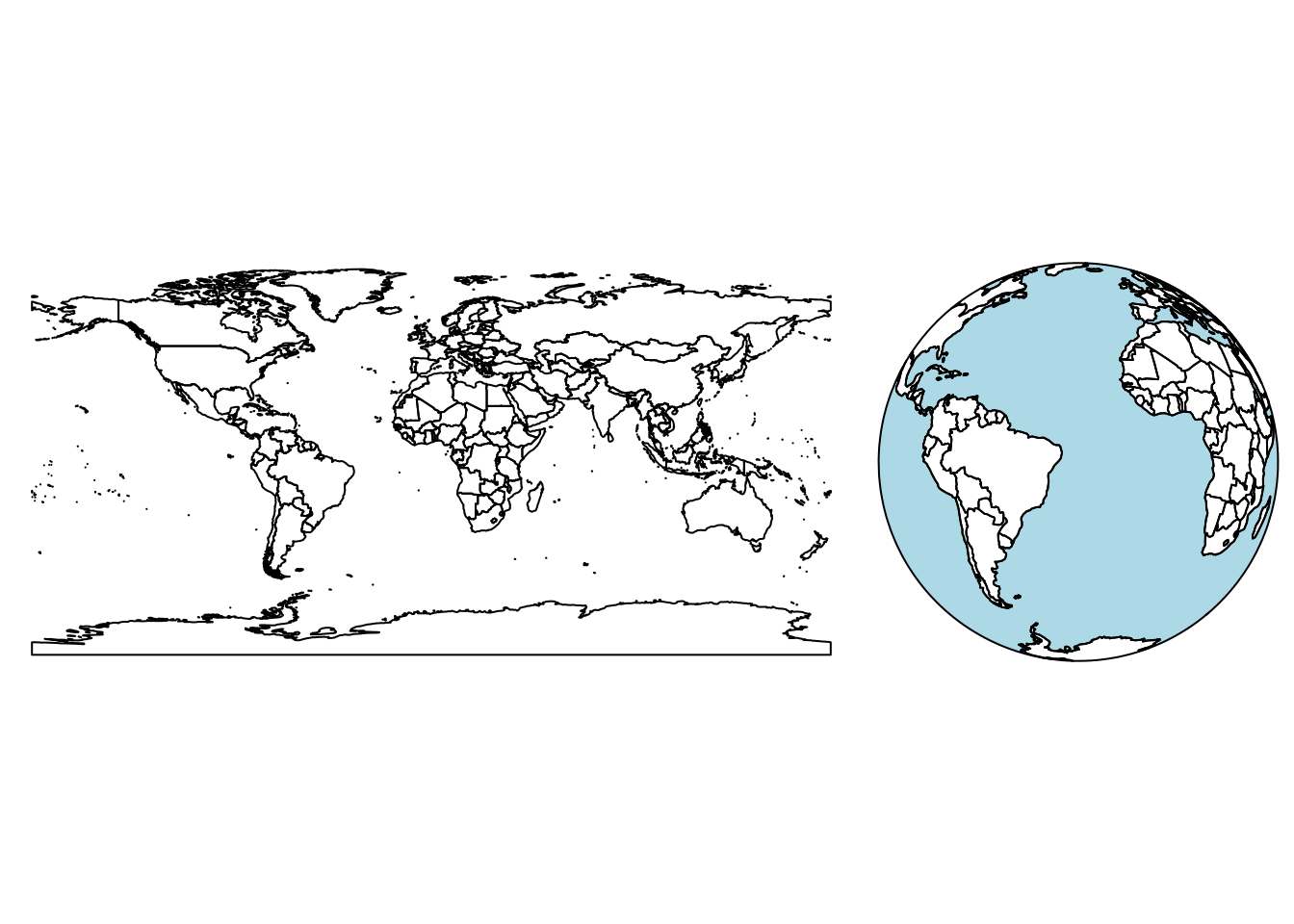
we think we "do nothing" as in @fig-world (left), or where we show
the world "as it is", as one would see it from space (@fig-world, right).
```{r fig-world, echo = !knitr::is_latex_output(), message = FALSE}
#| fig.cap: "Earth country boundaries; left: mapping long/lat linearly to $x$ and $y$ (plate carrée); right: as seen from an infinite distance (orthographic)"
#| out.width: 90%
library(sf)
library(rnaturalearth)
w <- ne_countries(scale = "medium", returnclass = "sf")
suppressWarnings(st_crs(w) <- st_crs('OGC:CRS84'))
layout(matrix(1:2, 1, 2), c(2,1))
par(mar = rep(0, 4))
plot(st_geometry(w))

# sphere:
stopifnot(sf_use_s2())
old <- options(s2_oriented = TRUE) # don't change orientation from here on
countries <- s2::s2_data_countries() |> st_as_sfc()
stopifnot(sf_use_s2()) # make sure it is, otherwise "POLYGON FULL" won't work
globe <- st_as_sfc("POLYGON FULL", crs = st_crs(countries))
oceans <- st_difference(globe, st_union(countries))
visible <- st_buffer(st_as_sfc("POINT(-30 -10)", crs = st_crs(countries)), 9800000) # visible half
visible_ocean <- st_intersection(visible, oceans)
visible_countries <- st_intersection(visible, countries)
st_transform(visible_ocean, "+proj=ortho +lat_0=-10 +lon_0=-30") |>
    plot(col = 'lightblue')
st_transform(visible_countries, "+proj=ortho +lat_0=-10 +lon_0=-30") |>
    plot(col = NA, add = TRUE)
options(old)
```
\newpage
The left plot of @fig-world was obtained by
::: panel-tabset
#### R
```{r eval=FALSE}
library(sf)
library(rnaturalearth)
w <- ne_countries(scale = "medium", returnclass = "sf")
plot(st_geometry(w))
```
#### Python
```{python}
# The shapefile can be downloaded at https://www.naturalearthdata.com/downloads/110m-cultural-vectors/110m-admin-0-countries/
import matplotlib.pyplot as plt
import geopandas as gpd
w = gpd.read_file('data/ne_110m_admin_0_countries.shp')
# Set up the figure and plot the countries
fig, ax = plt.subplots()
w.plot(ax=ax)
ax.axis(False)
```
:::
indicating that this is the default projection for global data with ellipsoidal coordinates:
::: panel-tabset
#### R
```{r}
st_is_longlat(w)
```
#### Python
```{python}
import geopandas as gpd
# create a GeoSeries with some coordinate tuples
w = gpd.read_file('data/ne_110m_admin_0_countries.shp')
geom = w.geometry
valid = geom.is_valid
print(valid)
```
:::
The projection taken in @fig-world (left) is the equirectangular
(or equidistant cylindrical) projection, which maps longitude and
latitude linearly to the $x$- and $y$-axis, keeping an aspect ratio of 1.
If we would do this for smaller areas not on the equator, then it
would make sense to choose a plot ratio such that one distance unit E-W
equals one distance unit N-S at the centre of the plotted area,
and this is the default behaviour of the `plot` method for
unprojected `sf` or `stars` datasets, as well as the default for
`ggplot2::geom_sf` (@sec-geomsf).
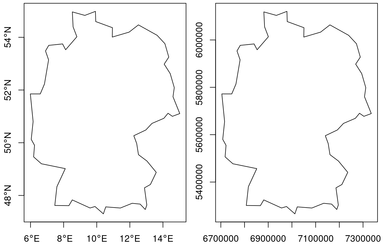
We can also carry out this projection before plotting. Say we want to
plot Germany, then after loading the (rough) country outline,
we use `st_transform` to project:
::: panel-tabset
#### R
```{r}
DE <- st_geometry(ne_countries(country = "germany",
                              returnclass = "sf"))
DE |> st_transform("+proj=eqc +lat_ts=51.14 +lon_0=90w") ->
    DE.eqc
```
#### Python
```{python}
import geopandas as gpd

ne = gpd.read_file('data/ne_110m_admin_0_countries.shp')
DE = ne[ne['NAME'] == "Germany"]
DE = DE.geometry
DE_eqc = DE.to_crs("+proj=eqc +lat_ts=51.14 +lon_0=90w")
```
:::
Here, `eqc` refers to the "equidistant cylindrical" projection of PROJ.
The projection parameter here is `lat_ts`, the latitude of _true
scale_, where one length unit N-S equals one length unit E-W.
This was chosen at the middle of the bounding box latitudes
::: panel-tabset
#### R
```{r, echo=!knitr::is_latex_output()}
#| code-fold: true
print(mean(st_bbox(DE)[c("ymin", "ymax")]), digits = 4)
```
#### Python
```{python}
#| code-fold: true
bbox = DE.total_bounds
mean_y = (bbox[1] + bbox[3]) / 2
round_mean_y = round(mean_y, 2)
print(round_mean_y)
```
:::
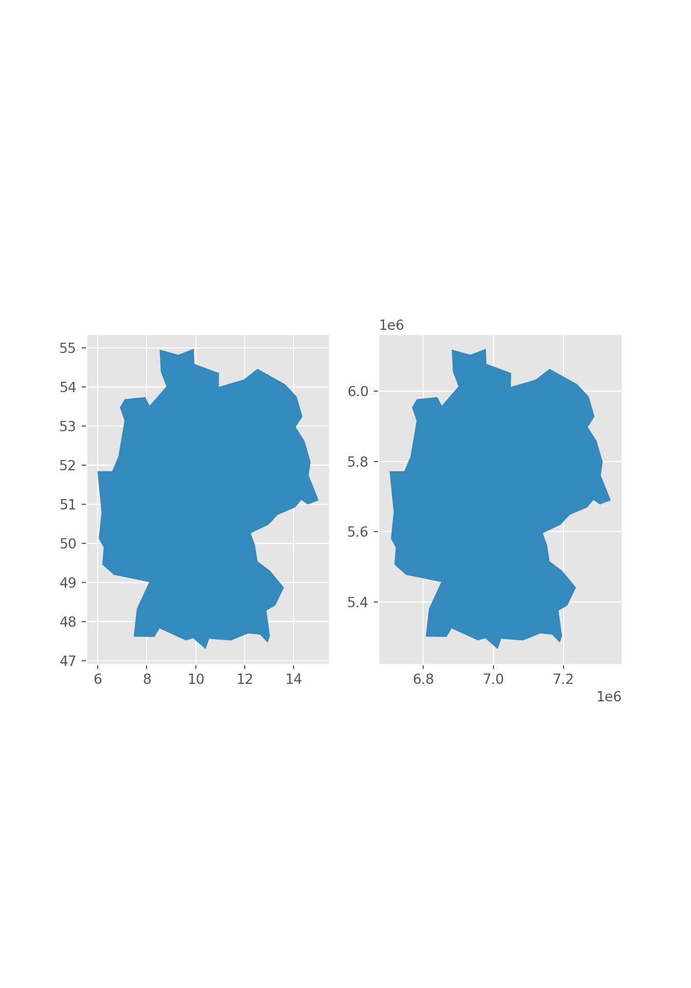
We plot both maps in @fig-eqc, and they look identical up to the values
along the axes: degrees for ellipsoidal (left) and metres for
projected (Cartesian, right) coordinates.
::: panel-tabset
#### R
```{r fig-eqc, echo=!knitr::is_latex_output()}
#| fig.height: 4.5
#| out.width: 70%
#| code-fold: true
#| fig.cap: "Germany in equirectangular projection: with axis units degrees (left) and metres in the equidistant cylindrical projection (right)"
par(mfrow = c(1, 2), mar = c(2.2, 2.2, 0.3, 0.5))
plot(DE, axes = TRUE)
plot(DE.eqc, axes = TRUE)
```
#### Python
```{python}
#| fig.height: 4.5
#| out.width: 70%
#| code-fold: true
#| fig.cap: "Germany in equirectangular projection: with axis units degrees (left) and metres in the equidistant cylindrical projection (right)"
import geopandas as gpd
import matplotlib.pyplot as plt
import matplotlib as mpl

plt.style.use('ggplot')

ne = gpd.read_file('data/ne_110m_admin_0_countries.shp')
DE = ne[ne['NAME'] == "Germany"]
DE_eqc = DE.to_crs("+proj=eqc +lat_ts=51.14 +lon_0=90w")

fig, axes = plt.subplots(ncols=2, figsize=(7, 10))
DE.geometry.plot(ax=axes[0])
DE_eqc.geometry.plot(ax=axes[1])

plt.show()
```
:::
### What is a good projection for my data?
\index{projection!properties}
There is unfortunately no silver bullet here. Projections that
maintain all distances do not exist; only globes do. The most
used projections try to preserve:
* areas (equal area)
* directions (conformal, such as _Mercator_)
* some properties of distances (_equirectangular_ preserves distances along meridians, _azimuthal equidistant_ preserves distances to a central point)
or some compromise of these. Parameters of projections decide what
is shown in the centre of a map and what is shown on the fringes, which
areas are up and which are down, and which areas are most enlarged.
All these choices are in the end political decisions.
It is often entertaining and at times educational to play around with
the different projections and understand their consequences. When
the primary purpose of the map however is not to entertain or educate
projection varieties, it may be preferable to choose a well-known or
less surprising projection and move the discussion which projection
to use to a decision process of its own. For global
maps however, in almost all cases, equal area projections are
preferred over plate carrée or web Mercator projections.
## Plotting points, lines, polygons, grid cells
\index{maps!plotting detail}
Since maps are just a special form of plots of statistical data,
the usual rules hold. Frequently occurring challenges include:
* polygons may be very small, and vanish when plotted
* depending on the data, polygons for different features may well
overlap, and be visible only partially; using transparent fill
colours may help identify them
* when points are plotted with symbols, they may easily overlap and be hidden; density maps (@sec-pointpatterns) may be more helpful
* lines may be hard to read when coloured and may overlap regardless the line width
### Colours
\index{maps!colours}
When plotting polygons filled with colours, one has the choice to plot
polygon boundaries or to suppress these. If polygon boundaries draw
too much attention, an alternative is to colour them in a grey tone,
or another colour that does not interfere with the fill colours. When
suppressing boundaries entirely, polygons with (nearly) identical
colours will no longer be visually distinguishable. If the property
indicating the fill colour is constant over the region, such as land
cover type, then this is not a problem, but if the property is an
aggregation then the region over which it was aggregated gets lost,
and by that the proper interpretation. Especially for extensive
variables, such as the amount of people living in a polygon, this
strongly misleads. But even with polygon boundaries, using filled
polygons for extensive variables may not be a good idea because
the map colours conflate amount and area size.
The use of continuous colour scales that have no noticeable colour
breaks for continuously varying variables may look attractive,
but is often more fancy than useful:
* it is impracticable to match a colour on the map with a legend value
* colour ramps often stretch non-linearly over the value range,
making it hard to convey magnitude
Only for cases where the identification of values is less
important than the continuity of the map, such as the colouring of
a high resolution digital terrain model, it does serve its goal.
Good colours scales and palettes are found in functions
`hcl.colors` or `palette.colors`, and in packages **RColorBrewer**
[@R-RColorBrewer], **viridis** [@R-viridis], or **colorspace**
[@R-colorspace; @colorspace].
### Colour breaks: `classInt` {#sec-classintervals}
\index{maps!colour breaks}
\index{colour breaks}
When plotting continuous geometry attributes using a limited set
of colours (or symbols), classes need to be made from the data.
R package **classInt** [@R-classInt] provides a number of methods to
do so. The default method is "quantile":
::: panel-tabset
#### R
```{r}
library(classInt)
# set.seed(1) if needed ?
r <- rnorm(100)
(cI <- classIntervals(r))
cI$brks
```
#### Python
```{python}
import pandas as pd
import numpy as np
np.random.seed(1)
r = np.random.normal(size=100)
n_classes = 8
breaks = pd.cut(r, n_classes, retbins=True)[1]
print(breaks)
```
:::
it takes argument `n` for the number of intervals, and a `style`
that can be one of "fixed", "sd", "equal", "pretty", "quantile",
"kmeans", "hclust", "bclust", "fisher" or "jenks". Style "pretty"
may not obey `n`; if `n` is missing, `nclass.Sturges` is used;
two other methods are available for choosing `n` automatically. If
the number of observations is greater than 3000, a 10\% sample is used
to create the breaks for "fisher" and "jenks".
### Graticule and other navigation aids {#sec-graticule}
\index{maps!graticule}
\index{graticule}
A graticule is a network of lines on a map that follow constant
latitude or longitude. @fig-first-map shows a graticule drawn in
grey, on @fig-firstgather it is white. Graticules are often drawn in
maps to give place reference. In our first map in @fig-first-map we
can read that the area plotted is near 35$^o$ North and 80$^o$ West.
Had we plotted the lines in the projected coordinate system, they
would have been straight and their actual numbers would not have
been very informative, apart from giving an interpretation of size
or distances when the unit is known, and familiar to the map reader.
Graticules also shed light on which projection was used:
equirectangular or Mercator projections have straight vertical and
horizontal lines, conic projections have straight but diverging
meridians, and equal area projections may have curved meridians.
\newpage
On @fig-world and most other maps the real navigation aid comes from
geographical features like the state outline, country outlines,
coast lines, rivers, roads, railways and so on. If these are added
sparsely and sufficiently, a graticule can as well be omitted. In
such cases, maps look good without axes, tics, and labels, leaving
up a lot of plotting space to be filled with actual map data.
## Base `plot`
\index{sf!plot method}
The `plot` method for `sf` and `stars` objects try to make quick,
useful, exploratory plots; for higher quality plots and more
configurability, alternatives with more control and/or better
defaults are offered for instance by packages **ggplot2** [@R-ggplot2],
**tmap** [@R-tmap; @tmap], or **mapsf** [@R-mapsf].
By default, the plot method tries to plot "all" it is given.
This means that:
* given a geometry only (`sfc`), the geometry is plotted, without colours
* given a geometry and an attribute, the geometry is coloured according to
the values of the attribute, using a qualitative colour scale for `factor`
or `logical` attributes and a continuous scale otherwise, and a colour key
is added
* given multiple attributes, multiple maps are plotted, each with a colour
scale but a key is by default omitted, as colour assignment is
done on a per sub-map basis
* for `stars` objects with multiple attributes, only the first
attribute is plotted; for three-dimensional raster cubes, all
slices over the third dimension are plotted as sub-plots
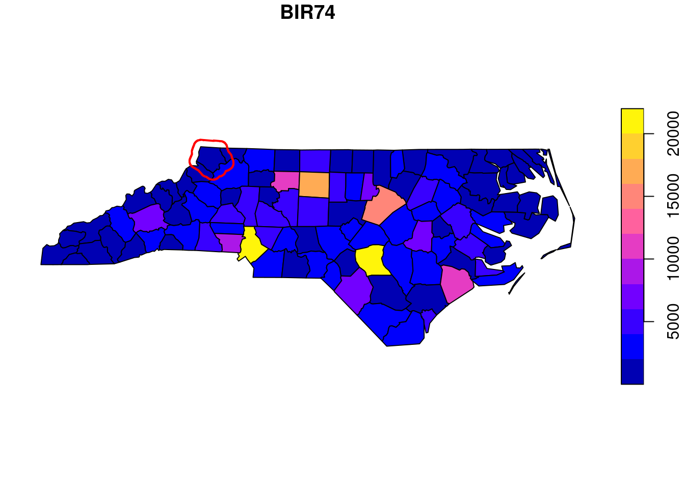
### Adding to plots with legends
\index{sf!plot!legend}
The `plot` methods for `stars` and `sf` objects may show a colour key
on one of the sides (@fig-first-map). To do this
with `base::plot`, the plot region is split in two and two plots are
created: one with the map, and one with the legend. By default, the
`plot` function resets the graphics device (using `layout(matrix(1))`
so that subsequent plots are not hindered by the device being split
in two, but this prevents adding graphic elements subsequently.
To _add_ to an existing plot with a colour legend, the device reset
needs to be prevented by using `reset = FALSE` in the `plot`
command, and using `add = TRUE` in subsequent calls to `plot`.
An example is
```{r fig-figreset}
#| fig.cap: "Annotating base plots with a legend"
library(sf)
nc <- read_sf(system.file("gpkg/nc.gpkg", package = "sf"))
plot(nc["BIR74"], reset = FALSE, key.pos = 4)
plot(st_buffer(nc[1,1], units::set_units(10, km)), col = 'NA',
     border = 'red', lwd = 2, add = TRUE)
```
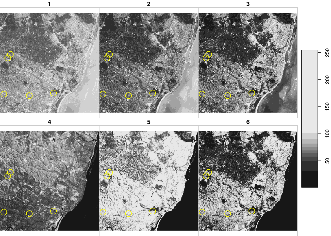
which is shown in @fig-figreset. Annotating `stars`
plots can be done in the same way when a _single_ stars layer is
shown. Annotating `stars` facet plots with multiple cube slices can be
done by adding a "hook" function that will be called on every slice
shown, as in
```{r fig-starshook}
#| fig.cap: "Annotated multi-slice stars plot"
library(stars)
system.file("tif/L7_ETMs.tif", package = "stars") |>
read_stars() -> r
st_bbox(r) |> st_as_sfc() |> st_sample(5) |>
st_buffer(300) -> circ
hook <- function() {
plot(circ, col = NA, border = 'yellow', add = TRUE)
}
plot(r, hook = hook, key.pos = 4)
```
and as shown in @fig-starshook. Hook functions have access to facet
parameters, facet label and bounding box.
Base plot methods have access to the resolution of the screen device,
and hence the base plot method for `stars` and `stars_proxy` object
will downsample dense rasters and only plot pixels at a density
that makes sense for the device available.
### Projections in base plots
The base `plot` method plots data with ellipsoidal coordinates
using the equirectangular projection, using a latitude parameter
equal to the middle latitude of the data bounding box
(@fig-eqc). To control this parameter, either a projection to
another equirectangular can be applied before plotting, or the
parameter `asp` can be set to override: `asp=1` would lead to
plate carrée (@fig-world) left. Subsequent plots need to be in
the same coordinate reference system in order to make sense with
over-plotting; this is not being checked.
### Colours and colour breaks
In base plots, argument `nbreaks` can be used to set the number of
colour breaks and argument `breaks` either to the numeric vector
with actual breaks, or to a style value for the `style` argument in
`classInt::classIntervals`.
## Maps with `ggplot2` {#sec-geomsf}
\index{ggplot2}
\index{geom\_sf}
Package **ggplot2** [@R-ggplot2; @ggplot2] can create
more complex and nicer looking graphs; it has a geometry `geom_sf`
that was developed in conjunction with the development of `sf` and
helps creating beautiful maps. An introduction to this is found in
@moreno. A first example is shown in @fig-firstgather.
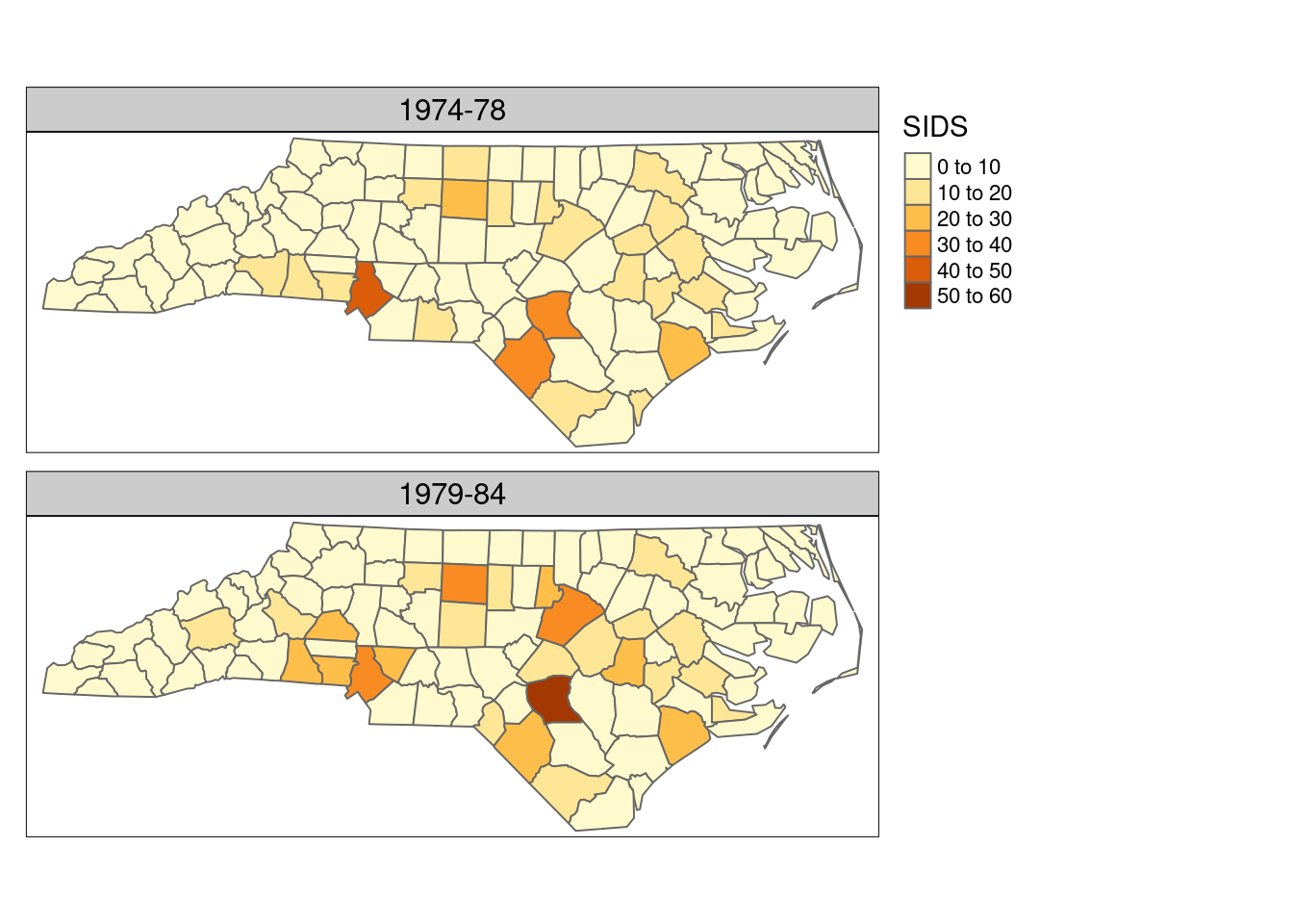
The code used for this plot is:
```{r}
library(tidyverse) |> suppressPackageStartupMessages()
nc.32119 <- st_transform(nc, 32119)
year_labels <-
    c("SID74" = "1974 - 1978", "SID79" = "1979 - 1984")
nc.32119 |> select(SID74, SID79) |>
    pivot_longer(starts_with("SID")) -> nc_longer
```
```{r eval = FALSE}
ggplot() + geom_sf(data = nc_longer, aes(fill = value), linewidth = 0.4) +
  facet_wrap(~ name, ncol = 1,
             labeller = labeller(name = year_labels)) +
  scale_y_continuous(breaks = 34:36) +
  scale_fill_gradientn(colours = sf.colors(20)) +
  theme(panel.grid.major = element_line(colour = "white"))
```
where we see that two attributes had to be stacked (`pivot_longer`)
before plotting them as facets: this is the idea behind "tidy" data,
and the `pivot_longer` method for `sf` objects automatically stacks
the geometry column too.
Because `ggplot2` creates graphics _objects_ before plotting them,
it can control the coordinate reference system of all elements
involved, and will transform or convert all subsequent objects to
the coordinate reference system of the first. It will also draw a
graticule for the (default) thin white lines on a grey background,
and uses a datum (by default: WGS84) for this. `geom_sf` can be
combined with other geoms, for instance to allow for annotating
plots.
\index{geom\_stars}
For package **stars**, a `geom_stars` has, at the moment of writing
this, rather limited scope: it uses `geom_sf` for map layout and vector data
cubes, and adds `geom_raster` for regular rasters and `geom_rect`
for rectilinear rasters. It downsamples if the user specifies a
downsampling rate, but has no access to the screen dimensions to
automatically choose a downsampling rate. This may be just enough,
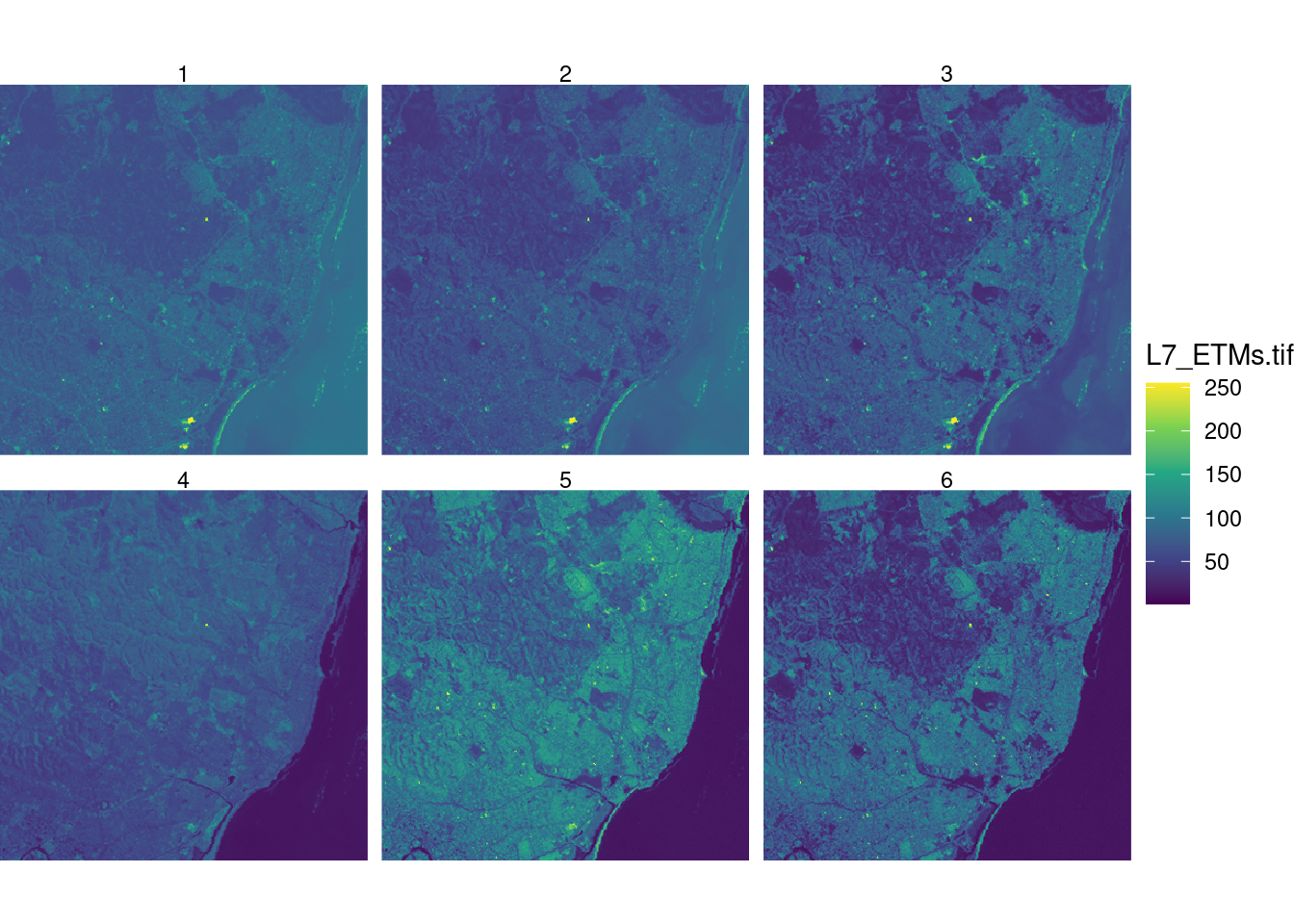
for instance @fig-ggplotstars is created by the following commands:
```{r fig-ggplotstars}
#| fig.cap: "Simple facet raster plot with `ggplot2` and `geom_stars`"
library(ggplot2)
library(stars)
r <- read_stars(system.file("tif/L7_ETMs.tif", package = "stars"))
ggplot() + geom_stars(data = r) +
        facet_wrap(~band) + coord_equal() +
        theme_void() +
        scale_x_discrete(expand = c(0,0)) +
        scale_y_discrete(expand = c(0,0)) +
        scale_fill_viridis_c()
```
More elaborate `ggplot2`-based plots with `stars` objects may be
obtained using package **ggspatial** [@R-ggspatial]. Non-compatible
but nevertheless `ggplot2`-style plots can be created with `tmap`,
a package dedicated to creating high quality maps (@sec-tmap).
\index[function]{coord\_sf}
When combining several feature sets with varying coordinate reference
systems, using `geom_sf`, all sets are transformed to the reference
system of the first set. To further control the "base"
coordinate reference system, `coord_sf` can be used. This allows
for instance working in a projected system, while combining graphics
elements that are _not_ `sf` objects but regular `data.frame`s
with ellipsoidal coordinates associated to WGS84.
::: {.content-visible when-format="html"}
A twitter thread by Claus Wilke illustrating this is found
[here](https://twitter.com/ClausWilke/status/1275938314055561216).
:::
<!---
FIXME: markup visible in PDF and HTML rendering
--->
## Maps with `tmap` {#sec-tmap}
\index{tmap}
Package **tmap** [@R-tmap; @tmap] takes a fresh look at plotting
spatial data in R. It resembles `ggplot2` in the sense that it
composes graphics objects before printing by building on the `grid`
package, and by concatenating map elements with a `+` between them,
but otherwise it is entirely independent from, and incompatible
with, `ggplot2`. It has a number of options that allow for highly
professional looking maps, and many defaults have been carefully
chosen. Creating a map with two similar attributes can be done
using `tm_polygons` with two attributes, we can use
```{r echo=TRUE, eval=FALSE}
library(tmap)
system.file("gpkg/nc.gpkg", package = "sf") |>
    read_sf() |> st_transform('EPSG:32119') -> nc.32119
tm_shape(nc.32119) +
    tm_polygons(c("SID74", "SID79"), title = "SIDS") +
    tm_layout(legend.outside = TRUE,
              panel.labels = c("1974-78", "1979-84")) +
    tm_facets(free.scales=FALSE)
```
to create @fig-tmapnc:
```{r fig-tmapnc, echo =!knitr::is_latex_output()}
#| fig.cap: "**tmap**: using `tm_polygons()` with two attribute names"
#| code-fold: true
library(tmap)
system.file("gpkg/nc.gpkg", package = "sf") |>
read_sf() |>
st_transform('EPSG:32119') -> nc.32119
tm_shape(nc.32119) + tm_polygons(c("SID74", "SID79"), title="SIDS") +
tm_layout(legend.outside=TRUE, panel.labels=c("1974-78", "1979-84")) +
tm_facets(free.scales=FALSE)
```
<!---
```{r eval=FALSE}
nc_longer <- nc.32119 |> select(SID74, SID79) |>
pivot_longer(starts_with("SID"), values_to = "SID")
tm_shape(nc_longer) + tm_polygons("SID") +
tm_facets(by = "name")
```
```{r fig-tmapnc2, echo = FALSE}
#| fig.cap: "**tmap**: Using `tm_facets()` on a long table"
nc.32119 |> select(SID74, SID79) |>
pivot_longer(starts_with("SID"), values_to = "SID") -> nc_longer
tm_shape(nc_longer) + tm_polygons("SID") + tm_facets(by = "name")
```
to create @fig-tmapnc2.
-->
Alternatively, from the long table form obtained by `pivot_longer`
one could use `+ tm_polygons("SID") + tm_facets(by = "name")`.
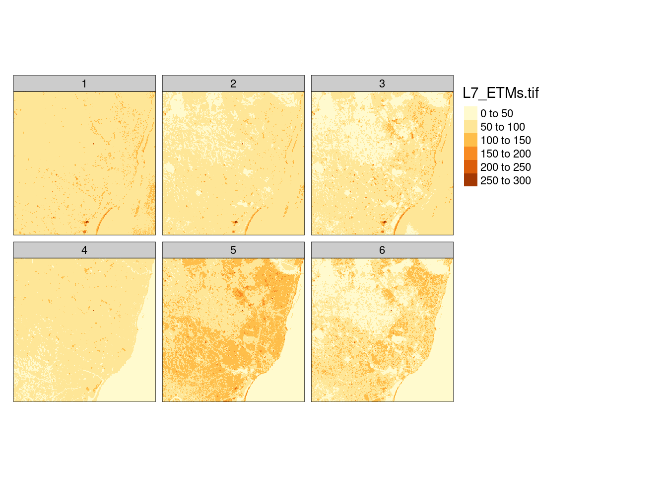
Package **tmap** also has support for `stars` objects, an example created with
```{r, eval = FALSE}
tm_shape(r) + tm_raster()
```
```{r fig-tmapstars, echo = FALSE}
#| fig.cap: "Simple raster plot with tmap"
tm_shape(r) + tm_raster()
```
is shown in @fig-tmapstars. More examples of the use of **tmap**
are given in Chapters [-@sec-area]-[-@sec-spatglmm].
## Interactive maps: `leaflet`, `mapview`, `tmap`
\index{leaflet}
\index{leaflet!tmap}
\index{leaflet!mapview}
\index{mapview}
\index{tmap!interactive views}
::: {.content-visible when-format="html"}
Interactive maps as shown in @fig-mapviewfigure can be
created with R packages **leaflet**, **mapview**, or **tmap**. Package **mapview**
adds a number of capabilities to **leaflet** including a map legend,
configurable pop-up windows when clicking features, support for
raster data, and scalable maps with very large feature sets using
the FlatGeobuf file format, as well as facet maps that react
synchronously to zoom and pan actions. Package **tmap** has the
option that after giving
```{r eval=FALSE}
tmap_mode("view")
```
all usual `tmap` commands are applied to an interactive html/leaflet widget,
whereas after
```{r eval=FALSE}
tmap_mode("plot")
```
again all output is sent to R's own (static) graphics device.
:::
::: {.content-visible when-format="pdf"}
Interactive maps as shown in @fig-mapviewfigurepdf can be
created with R packages **leaflet**, **mapview** or **tmap**. **mapview**
adds a number of capabilities to **leaflet** including a map legend,
configurable pop-up windows when clicking features, support for
raster data, and scalable maps with very large feature sets using
the FlatGeobuf file format, as well as facet maps that react
synchronously to zoom and pan actions. Package **tmap** has the
option that after giving
```{r eval=FALSE}
tmap_mode("view")
```
all usual `tmap` commands are applied to an interactive html/leaflet widget,
whereas after
```{r eval=FALSE}
tmap_mode("plot")
```
again all output is sent to R's own (static) graphics device.
:::
## Exercises
1. For the countries Indonesia and Canada, create individual plots using
equirectangular, orthographic, and Lambert equal area projections, while
choosing projection parameters sensible for the area.
1. Recreate the plot in @fig-figreset with **ggplot2** and with **tmap**.
1. Recreate the plot in @fig-tmapstars using the `viridis` colour ramp.
1. View the interactive plot in @fig-tmapstars using the "view"
(interactive) mode of `tmap`, and explore which interactions are possible; also
explore adding `+ tm_facets(as.layers=TRUE)` and try switching layers on and off.
Try also setting a transparency value to 0.5.