Together with timelines, maps belong to the most powerful graphs, perhaps because we can immediately relate to where we are, or once have been, on the space of the plot. Two recent books on visualisation (Healy 2018; Wilke 2019) contain chapters on visualising geospatial data or maps. Here, we will not try to point out which maps are good and which are bad, but rather a number of possibilities for creating them, challenges along the way, and possible ways to mitigate them.
8.1 Every plot is a projection
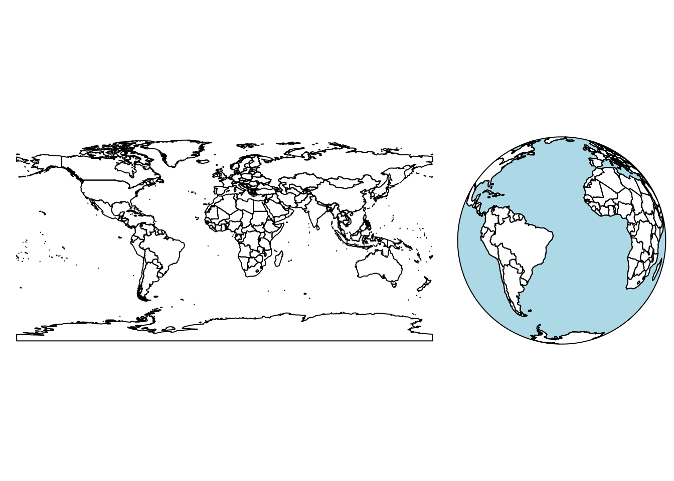
The world is round, but plotting devices are flat. As mentioned in Section 2.2.2, any time we visualise, in any way, the world on a flat device, we project: we convert ellipsoidal coordinates into Cartesian coordinates. This includes the cases where we think we “do nothing” as in Figure 8.1 (left), or where we show the world “as it is”, as one would see it from space (Figure 8.1, right).
Figure 8.1: Earth country boundaries; left: mapping long/lat linearly to \(x\) and \(y\) (plate carrée); right: as seen from an infinite distance (orthographic)
The projection taken in Figure 8.1 (left) is the equirectangular (or equidistant cylindrical) projection, which maps longitude and latitude linearly to the \(x\)- and \(y\)-axis, keeping an aspect ratio of 1. If we would do this for smaller areas not on the equator, then it would make sense to choose a plot ratio such that one distance unit E-W equals one distance unit N-S at the centre of the plotted area, and this is the default behaviour of the plot method for unprojected sf or stars datasets, as well as the default for ggplot2::geom_sf (Section 8.4).
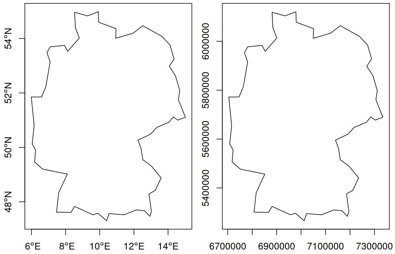
We can also carry out this projection before plotting. Say we want to plot Germany, then after loading the (rough) country outline, we use st_transform to project:
Here, eqc refers to the “equidistant cylindrical” projection of PROJ. The projection parameter here is lat_ts, the latitude of true scale, where one length unit N-S equals one length unit E-W. This was chosen at the middle of the bounding box latitudes
We plot both maps in Figure 8.2, and they look identical up to the values along the axes: degrees for ellipsoidal (left) and metres for projected (Cartesian, right) coordinates.
Figure 8.2: Germany in equirectangular projection: with axis units degrees (left) and metres in the equidistant cylindrical projection (right)
What is a good projection for my data?
There is unfortunately no silver bullet here. Projections that maintain all distances do not exist; only globes do. The most used projections try to preserve:
areas (equal area)
directions (conformal, such as Mercator)
some properties of distances (equirectangular preserves distances along meridians, azimuthal equidistant preserves distances to a central point)
or some compromise of these. Parameters of projections decide what is shown in the centre of a map and what is shown on the fringes, which areas are up and which are down, and which areas are most enlarged. All these choices are in the end political decisions.
It is often entertaining and at times educational to play around with the different projections and understand their consequences. When the primary purpose of the map however is not to entertain or educate projection varieties, it may be preferable to choose a well-known or less surprising projection and move the discussion which projection to use to a decision process of its own. For global maps however, in almost all cases, equal area projections are preferred over plate carrée or web Mercator projections.
8.2 Plotting points, lines, polygons, grid cells
Since maps are just a special form of plots of statistical data, the usual rules hold. Frequently occurring challenges include:
polygons may be very small, and vanish when plotted
depending on the data, polygons for different features may well overlap, and be visible only partially; using transparent fill colours may help identify them
when points are plotted with symbols, they may easily overlap and be hidden; density maps (Chapter 11) may be more helpful
lines may be hard to read when coloured and may overlap regardless the line width
Colours
When plotting polygons filled with colours, one has the choice to plot polygon boundaries or to suppress these. If polygon boundaries draw too much attention, an alternative is to colour them in a grey tone, or another colour that does not interfere with the fill colours. When suppressing boundaries entirely, polygons with (nearly) identical colours will no longer be visually distinguishable. If the property indicating the fill colour is constant over the region, such as land cover type, then this is not a problem, but if the property is an aggregation then the region over which it was aggregated gets lost, and by that the proper interpretation. Especially for extensive variables, such as the amount of people living in a polygon, this strongly misleads. But even with polygon boundaries, using filled polygons for extensive variables may not be a good idea because the map colours conflate amount and area size.
The use of continuous colour scales that have no noticeable colour breaks for continuously varying variables may look attractive, but is often more fancy than useful:
it is impracticable to match a colour on the map with a legend value
colour ramps often stretch non-linearly over the value range, making it hard to convey magnitude
Only for cases where the identification of values is less important than the continuity of the map, such as the colouring of a high resolution digital terrain model, it does serve its goal. Good colours scales and palettes are found in functions hcl.colors or palette.colors, and in packages RColorBrewer(Neuwirth 2022), viridis(Garnier 2021), or colorspace(Ihaka et al. 2023; Zeileis et al. 2020).
Colour breaks: classInt
When plotting continuous geometry attributes using a limited set of colours (or symbols), classes need to be made from the data. R package classInt(Bivand 2022) provides a number of methods to do so. The default method is “quantile”:
library(classInt)# set.seed(1) if needed ?r<-rnorm(100)(cI<-classIntervals(r))# style: quantile# one of 1.49e+10 possible partitions of this variable into 8 classes# [-2.12,-1.21) [-1.21,-0.732) [-0.732,-0.398) [-0.398,-0.0145) # 13 12 13 12 # [-0.0145,0.379) [0.379,0.815) [0.815,1.18) [1.18,2.76] # 12 13 12 13cI$brks# [1] -2.1247 -1.2066 -0.7323 -0.3977 -0.0145 0.3790 0.8146 1.1757# [9] 2.7616
it takes argument n for the number of intervals, and a style that can be one of “fixed”, “sd”, “equal”, “pretty”, “quantile”, “kmeans”, “hclust”, “bclust”, “fisher” or “jenks”. Style “pretty” may not obey n; if n is missing, nclass.Sturges is used; two other methods are available for choosing n automatically. If the number of observations is greater than 3000, a 10% sample is used to create the breaks for “fisher” and “jenks”.
Graticule and other navigation aids
A graticule is a network of lines on a map that follow constant latitude or longitude. Figure 1.1 shows a graticule drawn in grey, on Figure 1.2 it is white. Graticules are often drawn in maps to give place reference. In our first map in Figure 1.1 we can read that the area plotted is near 35\(^o\) North and 80\(^o\) West. Had we plotted the lines in the projected coordinate system, they would have been straight and their actual numbers would not have been very informative, apart from giving an interpretation of size or distances when the unit is known, and familiar to the map reader. Graticules also shed light on which projection was used: equirectangular or Mercator projections have straight vertical and horizontal lines, conic projections have straight but diverging meridians, and equal area projections may have curved meridians.
On Figure 8.1 and most other maps the real navigation aid comes from geographical features like the state outline, country outlines, coast lines, rivers, roads, railways and so on. If these are added sparsely and sufficiently, a graticule can as well be omitted. In such cases, maps look good without axes, tics, and labels, leaving up a lot of plotting space to be filled with actual map data.
8.3 Base plot
The plot method for sf and stars objects try to make quick, useful, exploratory plots; for higher quality plots and more configurability, alternatives with more control and/or better defaults are offered for instance by packages ggplot2(Wickham et al. 2022), tmap(Tennekes 2022, 2018), or mapsf(Giraud 2022).
By default, the plot method tries to plot “all” it is given. This means that:
given a geometry only (sfc), the geometry is plotted, without colours
given a geometry and an attribute, the geometry is coloured according to the values of the attribute, using a qualitative colour scale for factor or logical attributes and a continuous scale otherwise, and a colour key is added
given multiple attributes, multiple maps are plotted, each with a colour scale but a key is by default omitted, as colour assignment is done on a per sub-map basis
for stars objects with multiple attributes, only the first attribute is plotted; for three-dimensional raster cubes, all slices over the third dimension are plotted as sub-plots
Adding to plots with legends
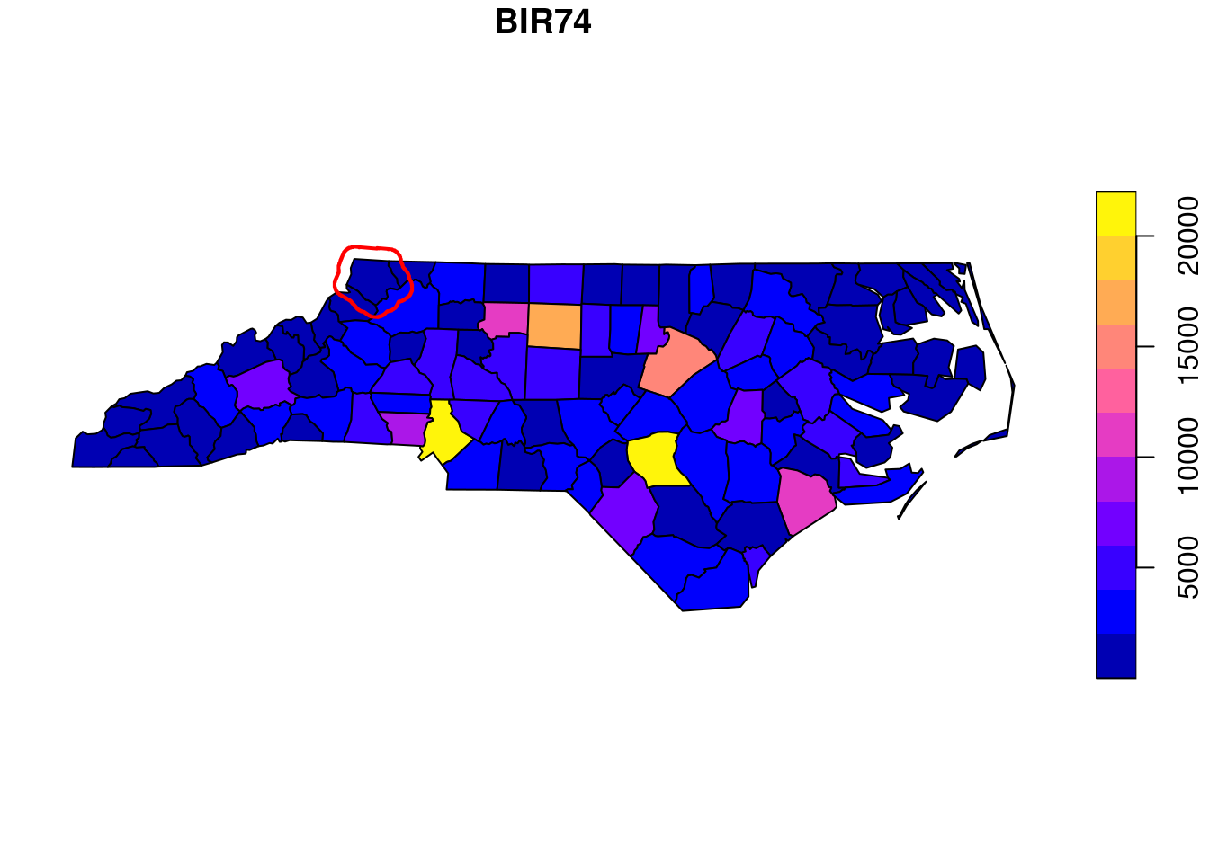
The plot methods for stars and sf objects may show a colour key on one of the sides (Figure 1.1). To do this with base::plot, the plot region is split in two and two plots are created: one with the map, and one with the legend. By default, the plot function resets the graphics device (using layout(matrix(1)) so that subsequent plots are not hindered by the device being split in two, but this prevents adding graphic elements subsequently. To add to an existing plot with a colour legend, the device reset needs to be prevented by using reset = FALSE in the plot command, and using add = TRUE in subsequent calls to plot. An example is
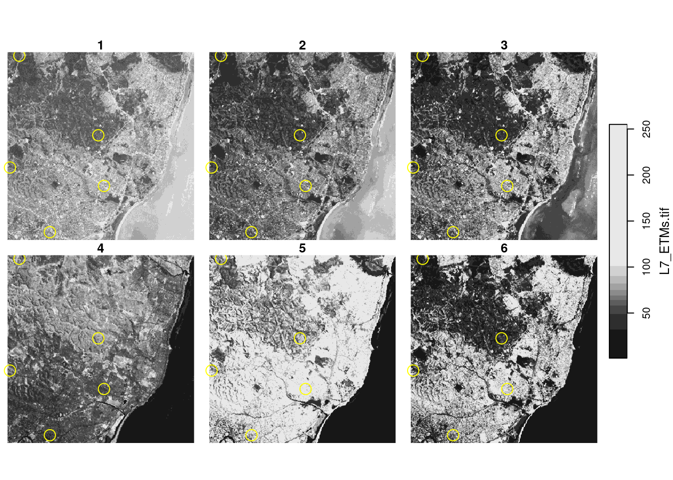
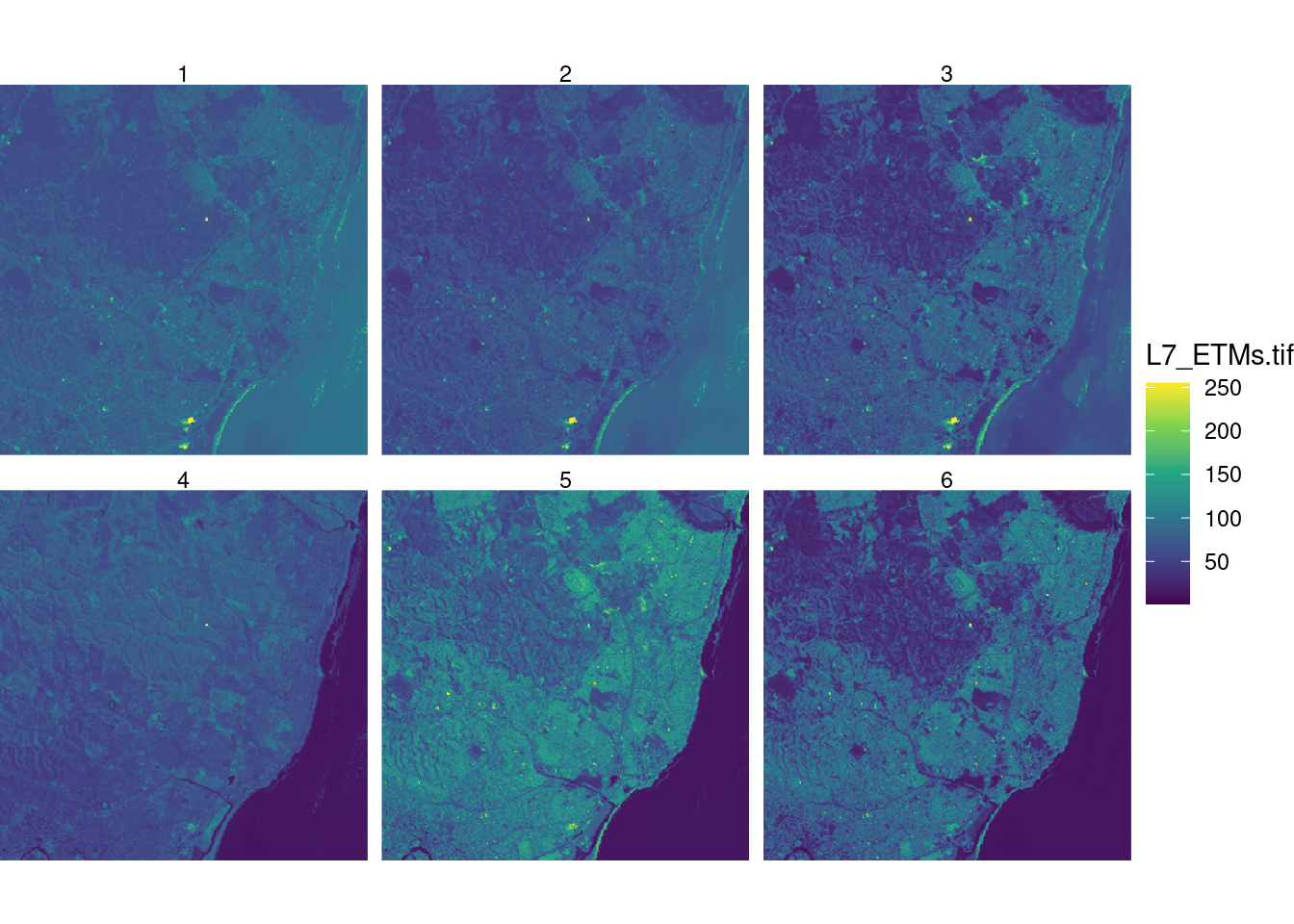
which is shown in Figure 8.3. Annotating stars plots can be done in the same way when a single stars layer is shown. Annotating stars facet plots with multiple cube slices can be done by adding a “hook” function that will be called on every slice shown, as in
and as shown in Figure 8.4. Hook functions have access to facet parameters, facet label and bounding box.
Base plot methods have access to the resolution of the screen device, and hence the base plot method for stars and stars_proxy object will downsample dense rasters and only plot pixels at a density that makes sense for the device available.
Projections in base plots
The base plot method plots data with ellipsoidal coordinates using the equirectangular projection, using a latitude parameter equal to the middle latitude of the data bounding box (Figure 8.2). To control this parameter, either a projection to another equirectangular can be applied before plotting, or the parameter asp can be set to override: asp=1 would lead to plate carrée (Figure 8.1) left. Subsequent plots need to be in the same coordinate reference system in order to make sense with over-plotting; this is not being checked.
Colours and colour breaks
In base plots, argument nbreaks can be used to set the number of colour breaks and argument breaks either to the numeric vector with actual breaks, or to a style value for the style argument in classInt::classIntervals.
8.4 Maps with ggplot2
Package ggplot2(Wickham et al. 2022; Wickham 2016) can create more complex and nicer looking graphs; it has a geometry geom_sf that was developed in conjunction with the development of sf and helps creating beautiful maps. An introduction to this is found in Moreno and Basille (2018). A first example is shown in Figure 1.2. The code used for this plot is:
where we see that two attributes had to be stacked (pivot_longer) before plotting them as facets: this is the idea behind “tidy” data, and the pivot_longer method for sf objects automatically stacks the geometry column too.
Because ggplot2 creates graphics objects before plotting them, it can control the coordinate reference system of all elements involved, and will transform or convert all subsequent objects to the coordinate reference system of the first. It will also draw a graticule for the (default) thin white lines on a grey background, and uses a datum (by default: WGS84) for this. geom_sf can be combined with other geoms, for instance to allow for annotating plots.
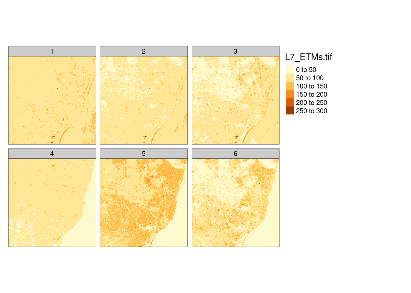
For package stars, a geom_stars has, at the moment of writing this, rather limited scope: it uses geom_sf for map layout and vector data cubes, and adds geom_raster for regular rasters and geom_rect for rectilinear rasters. It downsamples if the user specifies a downsampling rate, but has no access to the screen dimensions to automatically choose a downsampling rate. This may be just enough, for instance Figure 8.5 is created by the following commands:
Figure 8.5: Simple facet raster plot with ggplot2 and geom_stars
More elaborate ggplot2-based plots with stars objects may be obtained using package ggspatial(Dunnington 2022). Non-compatible but nevertheless ggplot2-style plots can be created with tmap, a package dedicated to creating high quality maps (Section 8.5).
When combining several feature sets with varying coordinate reference systems, using geom_sf, all sets are transformed to the reference system of the first set. To further control the “base” coordinate reference system, coord_sf can be used. This allows for instance working in a projected system, while combining graphics elements that are notsf objects but regular data.frames with ellipsoidal coordinates associated to WGS84.
A twitter thread by Claus Wilke illustrating this is found here.
8.5 Maps with tmap
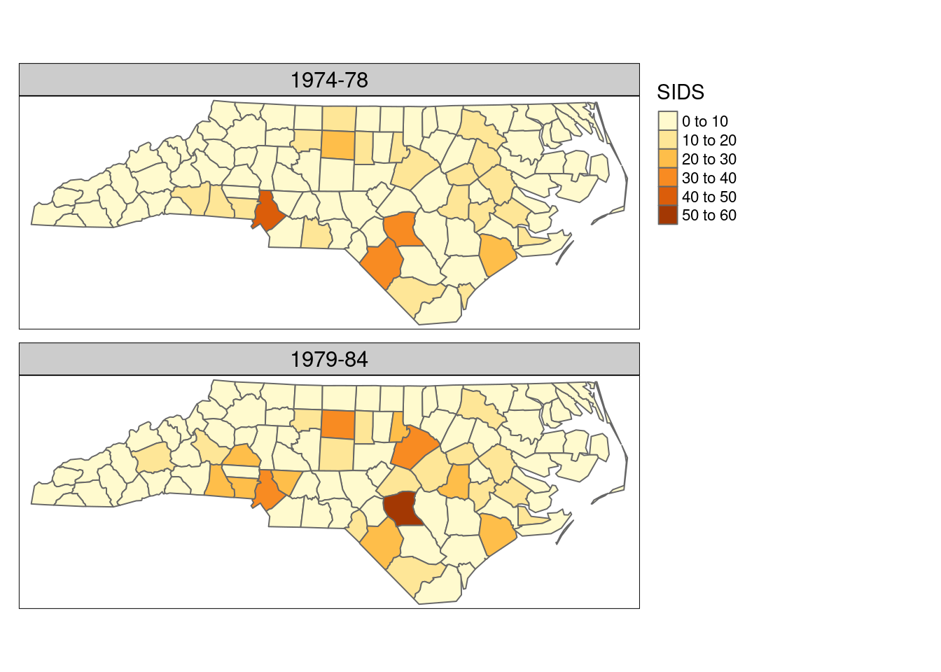
Package tmap(Tennekes 2022, 2018) takes a fresh look at plotting spatial data in R. It resembles ggplot2 in the sense that it composes graphics objects before printing by building on the grid package, and by concatenating map elements with a + between them, but otherwise it is entirely independent from, and incompatible with, ggplot2. It has a number of options that allow for highly professional looking maps, and many defaults have been carefully chosen. Creating a map with two similar attributes can be done using tm_polygons with two attributes, we can use
library(tmap)# # Attaching package: 'tmap'# The following object is masked from 'package:datasets':# # riverssystem.file("gpkg/nc.gpkg", package ="sf")|>read_sf()|>st_transform('EPSG:32119')->nc.32119tm_shape(nc.32119)+tm_polygons(c("SID74", "SID79"), title="SIDS")+tm_layout(legend.outside=TRUE, panel.labels=c("1974-78", "1979-84"))+tm_facets(free.scales=FALSE)# # ── tmap v3 code detected ───────────────────────────────────────────# [v3->v4] `tm_polygons()`: migrate the argument(s) related to the# legend of the visual variable `fill` namely 'title' to 'fill.legend# = tm_legend(<HERE>)'# tm_facets(): the argument free.scales is deprecated. Specify this via the layer functions (e.g. fill.free in tm_polygons)
Figure 8.6: tmap: using tm_polygons() with two attribute names
Alternatively, from the long table form obtained by pivot_longer one could use + tm_polygons("SID") + tm_facets(by = "name").
Package tmap also has support for stars objects, an example created with
is shown in Figure 8.7. More examples of the use of tmap are given in Chapters 14-16.
8.6 Interactive maps: leaflet, mapview, tmap
Interactive maps as shown in Figure 1.3 can be created with R packages leaflet, mapview, or tmap. Package mapview adds a number of capabilities to leaflet including a map legend, configurable pop-up windows when clicking features, support for raster data, and scalable maps with very large feature sets using the FlatGeobuf file format, as well as facet maps that react synchronously to zoom and pan actions. Package tmap has the option that after giving
again all output is sent to R’s own (static) graphics device.
8.7 Exercises
For the countries Indonesia and Canada, create individual plots using equirectangular, orthographic, and Lambert equal area projections, while choosing projection parameters sensible for the area.
Recreate the plot in Figure 8.3 with ggplot2 and with tmap.
Recreate the plot in Figure 8.7 using the viridis colour ramp.
View the interactive plot in Figure 8.7 using the “view” (interactive) mode of tmap, and explore which interactions are possible; also explore adding + tm_facets(as.layers=TRUE) and try switching layers on and off. Try also setting a transparency value to 0.5.
Healy, Kieran. 2018. Data Visualization, a Practical Introduction. Princeton University Press. http://socviz.co/index.html.
Ihaka, Ross, Paul Murrell, Kurt Hornik, Jason C. Fisher, Reto Stauffer, Claus O. Wilke, Claire D. McWhite, and Achim Zeileis. 2023. Colorspace: A Toolbox for Manipulating and Assessing Colors and Palettes. https://CRAN.R-project.org/package=colorspace.
Wickham, Hadley. 2016. Ggplot2: Elegant Graphics for Data Analysis. Springer.
Wickham, Hadley, Winston Chang, Lionel Henry, Thomas Lin Pedersen, Kohske Takahashi, Claus Wilke, Kara Woo, Hiroaki Yutani, and Dewey Dunnington. 2022. Ggplot2: Create Elegant Data Visualisations Using the Grammar of Graphics. https://CRAN.R-project.org/package=ggplot2.
Zeileis, Achim, Jason C. Fisher, Kurt Hornik, Ross Ihaka, Claire D. McWhite, Paul Murrell, Reto Stauffer, and Claus O. Wilke. 2020. “colorspace: A Toolbox for Manipulating and Assessing Colors and Palettes.”Journal of Statistical Software 96 (1): 1–49. https://doi.org/10.18637/jss.v096.i01.
Source Code
# Plotting spatial data {#sec-plotting}\index{maps!plotting}Together with timelines, maps belong to the most powerful graphs,perhaps because we can immediately relate to where we are, oronce have been, on the space of the plot. Two recent books onvisualisation [@Healy; @Wilke] contain chapters on visualisinggeospatial data or maps. Here, we will not try to point out whichmaps are good and which are bad, but rather a number ofpossibilities for creating them, challenges alongthe way, and possible ways to mitigate them.## Every plot is a projection {#sec-transform}\index{maps!projections}The world is round, but plotting devices are flat. As mentionedin @sec-projections, any time we visualise, in anyway, the world on a flat device, we project: we convert ellipsoidalcoordinates into Cartesian coordinates. This includes the cases wherewe think we "do nothing" as in @fig-world (left), or where we showthe world "as it is", as one would see it from space (@fig-world, right).```{r fig-world, echo = !knitr::is_latex_output(), message = FALSE}#| fig.cap: "Earth country boundaries; left: mapping long/lat linearly to $x$ and $y$ (plate carrée); right: as seen from an infinite distance (orthographic)"#| out.width: 90%library(sf)library(rnaturalearth)w <- ne_countries(scale = "medium", returnclass = "sf")suppressWarnings(st_crs(w) <- st_crs('OGC:CRS84'))layout(matrix(1:2, 1, 2), c(2,1))par(mar = rep(0, 4))plot(st_geometry(w))# sphere:old <- options(s2_oriented = TRUE) # don't change orientation from here oncountries <- s2::s2_data_countries() |> st_as_sfc()globe <- st_as_sfc("POLYGON FULL", crs = st_crs(countries))oceans <- st_difference(globe, st_union(countries))visible <- st_buffer(st_as_sfc("POINT(-30 -10)", crs = st_crs(countries)), 9800000) # visible halfvisible_ocean <- st_intersection(visible, oceans)visible_countries <- st_intersection(visible, countries)st_transform(visible_ocean, "+proj=ortho +lat_0=-10 +lon_0=-30") |> plot(col = 'lightblue')st_transform(visible_countries, "+proj=ortho +lat_0=-10 +lon_0=-30") |> plot(col = NA, add = TRUE)options(old)```\newpageThe left plot of @fig-world was obtained by```{r eval=FALSE}library(sf)library(rnaturalearth)w <- ne_countries(scale = "medium", returnclass = "sf")plot(st_geometry(w))```indicating that this is the default projection for global data with ellipsoidal coordinates:```{r}st_is_longlat(w)```The projection taken in @fig-world (left) is the equirectangular(or equidistant cylindrical) projection, which maps longitude andlatitude linearly to the $x$- and $y$-axis, keeping an aspect ratio of 1. If we would do this for smaller areas not on the equator, then itwould make sense to choose a plot ratio such that one distance unit E-Wequals one distance unit N-S at the centre of the plotted area,and this is the default behaviour of the `plot` method forunprojected `sf` or `stars` datasets, as well as the default for`ggplot2::geom_sf` (@sec-geomsf).We can also carry out this projection before plotting. Say we want toplot Germany, then after loading the (rough) country outline,we use `st_transform` to project:```{r}DE <-st_geometry(ne_countries(country ="germany",returnclass ="sf"))DE |>st_transform("+proj=eqc +lat_ts=51.14 +lon_0=90w") -> DE.eqc```Here, `eqc` refers to the "equidistant cylindrical" projection of PROJ.The projection parameter here is `lat_ts`, the latitude of _truescale_, where one length unit N-S equals one length unit E-W.This was chosen at the middle of the bounding box latitudes```{r, echo=!knitr::is_latex_output()}#| code-fold: trueprint(mean(st_bbox(DE)[c("ymin", "ymax")]), digits = 4)```We plot both maps in @fig-eqc, and they look identical up to the valuesalong the axes: degrees for ellipsoidal (left) and metres forprojected (Cartesian, right) coordinates.```{r fig-eqc, echo=!knitr::is_latex_output()}#| fig.height: 4.5#| out.width: 70%#| code-fold: true#| fig.cap: "Germany in equirectangular projection: with axis units degrees (left) and metres in the equidistant cylindrical projection (right)"par(mfrow = c(1, 2), mar = c(2.2, 2.2, 0.3, 0.5))plot(DE, axes = TRUE)plot(DE.eqc, axes = TRUE)```### What is a good projection for my data?\index{projection!properties}There is unfortunately no silver bullet here. Projections thatmaintain all distances do not exist; only globes do. The mostused projections try to preserve:* areas (equal area)* directions (conformal, such as _Mercator_)* some properties of distances (_equirectangular_ preserves distances along meridians, _azimuthal equidistant_ preserves distances to a central point)or some compromise of these. Parameters of projections decide whatis shown in the centre of a map and what is shown on the fringes, whichareas are up and which are down, and which areas are most enlarged.All these choices are in the end political decisions.It is often entertaining and at times educational to play around withthe different projections and understand their consequences. Whenthe primary purpose of the map however is not to entertain or educateprojection varieties, it may be preferable to choose a well-known orless surprising projection and move the discussion which projectionto use to a decision process of its own. For globalmaps however, in almost all cases, equal area projections arepreferred over plate carrée or web Mercator projections.## Plotting points, lines, polygons, grid cells\index{maps!plotting detail}Since maps are just a special form of plots of statistical data,the usual rules hold. Frequently occurring challenges include:* polygons may be very small, and vanish when plotted* depending on the data, polygons for different features may welloverlap, and be visible only partially; using transparent fillcolours may help identify them* when points are plotted with symbols, they may easily overlap and be hidden; density maps (@sec-pointpatterns) may be more helpful* lines may be hard to read when coloured and may overlap regardless the line width### Colours\index{maps!colours}When plotting polygons filled with colours, one has the choice to plotpolygon boundaries or to suppress these. If polygon boundaries drawtoo much attention, an alternative is to colour them in a grey tone,or another colour that does not interfere with the fill colours. Whensuppressing boundaries entirely, polygons with (nearly) identicalcolours will no longer be visually distinguishable. If the propertyindicating the fill colour is constant over the region, such as landcover type, then this is not a problem, but if the property is anaggregation then the region over which it was aggregated gets lost,and by that the proper interpretation. Especially for extensivevariables, such as the amount of people living in a polygon, thisstrongly misleads. But even with polygon boundaries, using filledpolygons for extensive variables may not be a good idea becausethe map colours conflate amount and area size.The use of continuous colour scales that have no noticeable colourbreaks for continuously varying variables may look attractive,but is often more fancy than useful:* it is impracticable to match a colour on the map with a legend value* colour ramps often stretch non-linearly over the value range,making it hard to convey magnitudeOnly for cases where the identification of values is lessimportant than the continuity of the map, such as the colouring ofa high resolution digital terrain model, it does serve its goal.Good colours scales and palettes are found in functions`hcl.colors` or `palette.colors`, and in packages **RColorBrewer**[@R-RColorBrewer], **viridis** [@R-viridis], or **colorspace**[@R-colorspace; @colorspace].### Colour breaks: `classInt` {#sec-classintervals}\index{maps!colour breaks}\index{colour breaks}When plotting continuous geometry attributes using a limited setof colours (or symbols), classes need to be made from the data.R package **classInt** [@R-classInt] provides a number of methods todo so. The default method is "quantile":```{r}library(classInt)# set.seed(1) if needed ?r <-rnorm(100)(cI <-classIntervals(r))cI$brks```it takes argument `n` for the number of intervals, and a `style`that can be one of "fixed", "sd", "equal", "pretty", "quantile","kmeans", "hclust", "bclust", "fisher" or "jenks". Style "pretty"may not obey `n`; if `n` is missing, `nclass.Sturges` is used;two other methods are available for choosing `n` automatically. If the number of observations is greater than 3000, a 10\% sample is usedto create the breaks for "fisher" and "jenks".### Graticule and other navigation aids {#sec-graticule}\index{maps!graticule}\index{graticule}A graticule is a network of lines on a map that follow constantlatitude or longitude. @fig-first-map shows a graticule drawn ingrey, on @fig-firstgather it is white. Graticules are often drawn inmaps to give place reference. In our first map in @fig-first-map wecan read that the area plotted is near 35$^o$ North and 80$^o$ West.Had we plotted the lines in the projected coordinate system, theywould have been straight and their actual numbers would not havebeen very informative, apart from giving an interpretation of sizeor distances when the unit is known, and familiar to the map reader.Graticules also shed light on which projection was used:equirectangular or Mercator projections have straight vertical andhorizontal lines, conic projections have straight but divergingmeridians, and equal area projections may have curved meridians.\newpageOn @fig-world and most other maps the real navigation aid comes fromgeographical features like the state outline, country outlines,coast lines, rivers, roads, railways and so on. If these are addedsparsely and sufficiently, a graticule can as well be omitted. Insuch cases, maps look good without axes, tics, and labels, leavingup a lot of plotting space to be filled with actual map data.## Base `plot`\index{sf!plot method}The `plot` method for `sf` and `stars` objects try to make quick,useful, exploratory plots; for higher quality plots and moreconfigurability, alternatives with more control and/or betterdefaults are offered for instance by packages **ggplot2** [@R-ggplot2],**tmap** [@R-tmap; @tmap], or **mapsf** [@R-mapsf].By default, the plot method tries to plot "all" it is given.This means that:* given a geometry only (`sfc`), the geometry is plotted, without colours* given a geometry and an attribute, the geometry is coloured according to the values of the attribute, using a qualitative colour scale for `factor` or `logical` attributes and a continuous scale otherwise, and a colour key is added* given multiple attributes, multiple maps are plotted, each with a colour scale but a key is by default omitted, as colour assignment is done on a per sub-map basis* for `stars` objects with multiple attributes, only the first attribute is plotted; for three-dimensional raster cubes, all slices over the third dimension are plotted as sub-plots### Adding to plots with legends\index{sf!plot!legend}The `plot` methods for `stars` and `sf` objects may show a colour keyon one of the sides (@fig-first-map). To do thiswith `base::plot`, the plot region is split in two and two plots arecreated: one with the map, and one with the legend. By default, the`plot` function resets the graphics device (using `layout(matrix(1))`so that subsequent plots are not hindered by the device being splitin two, but this prevents adding graphic elements subsequently.To _add_ to an existing plot with a colour legend, the device resetneeds to be prevented by using `reset = FALSE` in the `plot`command, and using `add = TRUE` in subsequent calls to `plot`.An example is```{r fig-figreset}#| fig.cap: "Annotating base plots with a legend"library(sf)nc <- read_sf(system.file("gpkg/nc.gpkg", package = "sf"))plot(nc["BIR74"], reset = FALSE, key.pos = 4)plot(st_buffer(nc[1,1], units::set_units(10, km)), col = 'NA', border = 'red', lwd = 2, add = TRUE)```which is shown in @fig-figreset. Annotating `stars`plots can be done in the same way when a _single_ stars layer isshown. Annotating `stars` facet plots with multiple cube slices can bedone by adding a "hook" function that will be called on every sliceshown, as in```{r fig-starshook}#| fig.cap: "Annotated multi-slice stars plot"library(stars)system.file("tif/L7_ETMs.tif", package = "stars") |> read_stars() -> rst_bbox(r) |> st_as_sfc() |> st_sample(5) |> st_buffer(300) -> circhook <- function() { plot(circ, col = NA, border = 'yellow', add = TRUE)}plot(r, hook = hook, key.pos = 4)```and as shown in @fig-starshook. Hook functions have access to facetparameters, facet label and bounding box.Base plot methods have access to the resolution of the screen device,and hence the base plot method for `stars` and `stars_proxy` objectwill downsample dense rasters and only plot pixels at a densitythat makes sense for the device available.### Projections in base plotsThe base `plot` method plots data with ellipsoidal coordinatesusing the equirectangular projection, using a latitude parameterequal to the middle latitude of the data bounding box(@fig-eqc). To control this parameter, either a projection toanother equirectangular can be applied before plotting, or theparameter `asp` can be set to override: `asp=1` would lead toplate carrée (@fig-world) left. Subsequent plots need to be inthe same coordinate reference system in order to make sense withover-plotting; this is not being checked.### Colours and colour breaksIn base plots, argument `nbreaks` can be used to set the number ofcolour breaks and argument `breaks` either to the numeric vectorwith actual breaks, or to a style value for the `style` argument in`classInt::classIntervals`.## Maps with `ggplot2` {#sec-geomsf}\index{ggplot2}\index{geom\_sf}Package **ggplot2** [@R-ggplot2; @ggplot2] can createmore complex and nicer looking graphs; it has a geometry `geom_sf`that was developed in conjunction with the development of `sf` andhelps creating beautiful maps. An introduction to this is found in@moreno. A first example is shown in @fig-firstgather.The code used for this plot is:```{r}library(tidyverse) |>suppressPackageStartupMessages()nc.32119<-st_transform(nc, 32119) year_labels <-c("SID74"="1974 - 1978", "SID79"="1979 - 1984")nc.32119|>select(SID74, SID79) |>pivot_longer(starts_with("SID")) -> nc_longer``````{r eval = FALSE}ggplot() + geom_sf(data = nc_longer, aes(fill = value), linewidth = 0.4) + facet_wrap(~ name, ncol = 1, labeller = labeller(name = year_labels)) + scale_y_continuous(breaks = 34:36) + scale_fill_gradientn(colours = sf.colors(20)) + theme(panel.grid.major = element_line(colour = "white"))```where we see that two attributes had to be stacked (`pivot_longer`)before plotting them as facets: this is the idea behind "tidy" data,and the `pivot_longer` method for `sf` objects automatically stacksthe geometry column too.Because `ggplot2` creates graphics _objects_ before plotting them,it can control the coordinate reference system of all elementsinvolved, and will transform or convert all subsequent objects tothe coordinate reference system of the first. It will also draw agraticule for the (default) thin white lines on a grey background,and uses a datum (by default: WGS84) for this. `geom_sf` can becombined with other geoms, for instance to allow for annotatingplots.\index{geom\_stars}For package **stars**, a `geom_stars` has, at the moment of writingthis, rather limited scope: it uses `geom_sf` for map layout and vector datacubes, and adds `geom_raster` for regular rasters and `geom_rect`for rectilinear rasters. It downsamples if the user specifies adownsampling rate, but has no access to the screen dimensions toautomatically choose a downsampling rate. This may be just enough, for instance @fig-ggplotstars is created by the following commands:```{r fig-ggplotstars}#| fig.cap: "Simple facet raster plot with `ggplot2` and `geom_stars`"library(ggplot2)library(stars)r <- read_stars(system.file("tif/L7_ETMs.tif", package = "stars"))ggplot() + geom_stars(data = r) + facet_wrap(~band) + coord_equal() + theme_void() + scale_x_discrete(expand = c(0,0)) + scale_y_discrete(expand = c(0,0)) + scale_fill_viridis_c()```More elaborate `ggplot2`-based plots with `stars` objects may beobtained using package **ggspatial** [@R-ggspatial]. Non-compatiblebut nevertheless `ggplot2`-style plots can be created with `tmap`,a package dedicated to creating high quality maps (@sec-tmap).\index[function]{coord\_sf}When combining several feature sets with varying coordinate referencesystems, using `geom_sf`, all sets are transformed to the referencesystem of the first set. To further control the "base"coordinate reference system, `coord_sf` can be used. This allowsfor instance working in a projected system, while combining graphicselements that are _not_ `sf` objects but regular `data.frame`swith ellipsoidal coordinates associated to WGS84. ::: {.content-visible when-format="html"}A twitter thread by Claus Wilke illustrating this is found[here](https://twitter.com/ClausWilke/status/1275938314055561216).:::<!---FIXME: markup visible in PDF and HTML rendering--->## Maps with `tmap` {#sec-tmap}\index{tmap}Package **tmap** [@R-tmap; @tmap] takes a fresh look at plottingspatial data in R. It resembles `ggplot2` in the sense that itcomposes graphics objects before printing by building on the `grid`package, and by concatenating map elements with a `+` between them,but otherwise it is entirely independent from, and incompatiblewith, `ggplot2`. It has a number of options that allow for highlyprofessional looking maps, and many defaults have been carefullychosen. Creating a map with two similar attributes can be doneusing `tm_polygons` with two attributes, we can use ```{r echo=TRUE, eval=FALSE}library(tmap)system.file("gpkg/nc.gpkg", package = "sf") |> read_sf() |> st_transform('EPSG:32119') -> nc.32119tm_shape(nc.32119) + tm_polygons(c("SID74", "SID79"), title = "SIDS") + tm_layout(legend.outside = TRUE, panel.labels = c("1974-78", "1979-84")) + tm_facets(free.scales=FALSE)```to create @fig-tmapnc:```{r fig-tmapnc, echo =!knitr::is_latex_output()}#| fig.cap: "**tmap**: using `tm_polygons()` with two attribute names"#| code-fold: truelibrary(tmap)system.file("gpkg/nc.gpkg", package = "sf") |> read_sf() |> st_transform('EPSG:32119') -> nc.32119tm_shape(nc.32119) + tm_polygons(c("SID74", "SID79"), title="SIDS") + tm_layout(legend.outside=TRUE, panel.labels=c("1974-78", "1979-84")) + tm_facets(free.scales=FALSE)```<!---```{r eval=FALSE}nc_longer <- nc.32119 |> select(SID74, SID79) |> pivot_longer(starts_with("SID"), values_to = "SID")tm_shape(nc_longer) + tm_polygons("SID") + tm_facets(by = "name")``````{r fig-tmapnc2, echo = FALSE}#| fig.cap: "**tmap**: Using `tm_facets()` on a long table"nc.32119 |> select(SID74, SID79) |> pivot_longer(starts_with("SID"), values_to = "SID") -> nc_longertm_shape(nc_longer) + tm_polygons("SID") + tm_facets(by = "name")```to create @fig-tmapnc2.-->Alternatively, from the long table form obtained by `pivot_longer`one could use `+ tm_polygons("SID") + tm_facets(by = "name")`.Package **tmap** also has support for `stars` objects, an example created with```{r, eval = FALSE}tm_shape(r) + tm_raster()``````{r fig-tmapstars, echo = FALSE}#| fig.cap: "Simple raster plot with tmap"tm_shape(r) + tm_raster()```is shown in @fig-tmapstars. More examples of the use of **tmap**are given in Chapters [-@sec-area]-[-@sec-spatglmm].## Interactive maps: `leaflet`, `mapview`, `tmap`\index{leaflet}\index{leaflet!tmap}\index{leaflet!mapview}\index{mapview}\index{tmap!interactive views}::: {.content-visible when-format="html"}Interactive maps as shown in @fig-mapviewfigure can becreated with R packages **leaflet**, **mapview**, or **tmap**. Package **mapview**adds a number of capabilities to **leaflet** including a map legend,configurable pop-up windows when clicking features, support forraster data, and scalable maps with very large feature sets usingthe FlatGeobuf file format, as well as facet maps that reactsynchronously to zoom and pan actions. Package **tmap** has theoption that after giving```{r eval=FALSE}tmap_mode("view")```all usual `tmap` commands are applied to an interactive html/leaflet widget, whereas after```{r eval=FALSE}tmap_mode("plot")```again all output is sent to R's own (static) graphics device.:::::: {.content-visible when-format="pdf"}Interactive maps as shown in @fig-mapviewfigurepdf can becreated with R packages **leaflet**, **mapview** or **tmap**. **mapview**adds a number of capabilities to **leaflet** including a map legend,configurable pop-up windows when clicking features, support forraster data, and scalable maps with very large feature sets usingthe FlatGeobuf file format, as well as facet maps that reactsynchronously to zoom and pan actions. Package **tmap** has theoption that after giving```{r eval=FALSE}tmap_mode("view")```all usual `tmap` commands are applied to an interactive html/leaflet widget, whereas after```{r eval=FALSE}tmap_mode("plot")```again all output is sent to R's own (static) graphics device.:::## Exercises1. For the countries Indonesia and Canada, create individual plots usingequirectangular, orthographic, and Lambert equal area projections, whilechoosing projection parameters sensible for the area.1. Recreate the plot in @fig-figreset with **ggplot2** and with **tmap**.1. Recreate the plot in @fig-tmapstars using the `viridis` colour ramp.1. View the interactive plot in @fig-tmapstars using the "view"(interactive) mode of `tmap`, and explore which interactions are possible; alsoexplore adding `+ tm_facets(as.layers=TRUE)` and try switching layers on and off.Try also setting a transparency value to 0.5.