Drawing beautiful maps programmatically with R, sf and ggplot2 — Part 2: Layers
This tutorial is the second part in a series of three:
- General concepts illustrated with the world map
- Adding additional layers: an example with points and polygons (this document)
- Positioning and layout for complex maps
In the previous part, we presented general concepts with a map with
little information (country borders only). The modular approach of
ggplot2 allows to successively add additional layers, for instance
study sites or administrative delineations, as will be illustrated in
this part.
Getting started
Many R packages are available from CRAN, the Comprehensive R Archive Network, which is the primary repository of R packages. The full list of packages necessary for this series of tutorials can be installed with:
install.packages(c("cowplot", "googleway", "ggplot2", "ggrepel",
"ggspatial", "libwgeom", "sf", "rnaturalearth", "rnaturalearthdata"))
We start by loading the basic packages necessary for all maps, i.e.
ggplot2 and sf. We also suggest to use the classic dark-on-light
theme for ggplot2 (theme_bw), which is more appropriate for maps:
library("ggplot2")
theme_set(theme_bw())
library("sf")
The package rnaturalearth provides a map of countries of the entire
world. Use ne_countries to pull country data and choose the scale
(rnaturalearthhires is necessary for scale = "large"). The
function can return sp classes (default) or directly sf classes,
as defined in the argument returnclass:
library("rnaturalearth")
library("rnaturalearthdata")

world <- ne_countries(scale = "medium", returnclass = "sf")
class(world)

## [1] "sf"
## [1] "data.frame"
Adding additional layers: an example with points and polygons
Field sites (point data)
We start by defining two study sites, according to their longitude and
latitude, stored in a regular data.frame:
(sites <- data.frame(longitude = c(-80.144005, -80.109), latitude = c(26.479005,
    26.83)))

##   longitude latitude
## 1 -80.14401 26.47901
## 2 -80.10900 26.83000
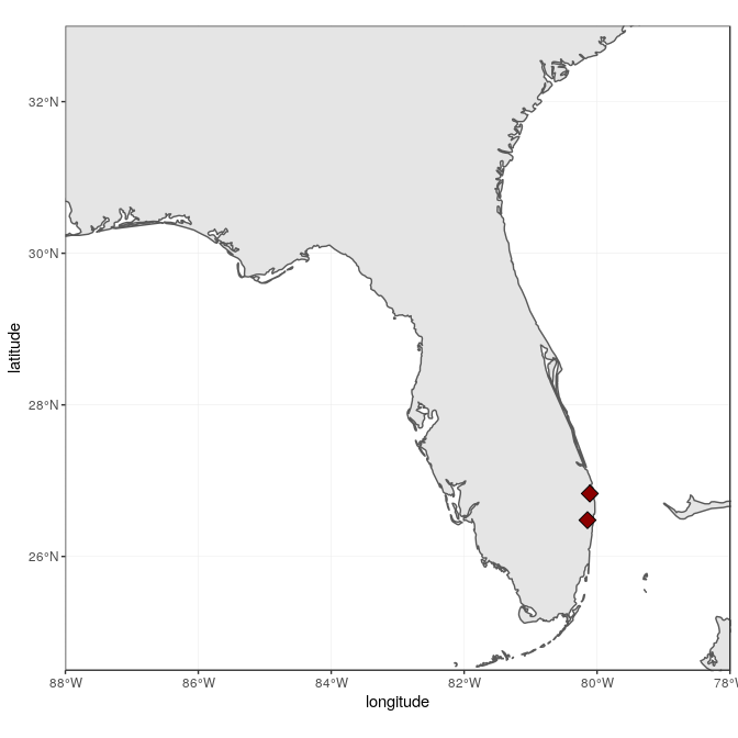
The quickest way to add point coordinates is with the general-purpose
function geom_point, which works on any X/Y coordinates, of regular
data points (i.e. not geographic). As such, we can adjust all
characteristics of points (e.g. color of the outline and the filling,
shape, size, etc.), for all points, or using grouping from the data (i.e
defining their “aesthetics”). In this example, we add the two points as
diamonds (shape = 23), filled in dark red (fill = "darkred") and of
bigger size (size = 4):
ggplot(data = world) +
    geom_sf() +
    geom_point(data = sites, aes(x = longitude, y = latitude), size = 4,
        shape = 23, fill = "darkred") +
    coord_sf(xlim = c(-88, -78), ylim = c(24.5, 33), expand = FALSE)
A better, more flexible alternative is to use the power of sf:
Converting the data frame to a sf object allows to rely on sf to
handle on the fly the coordinate system (both projection and extent),
which can be very useful if the two objects (here world map, and sites)
are not in the same projection. To achieve the same result, the
projection (here WGS84, which is the CRS code #4326) has to be a priori
defined in the sf object:
(sites <- st_as_sf(sites, coords = c("longitude", "latitude"),
    crs = 4326, agr = "constant"))

## Simple feature collection with 2 features and 0 fields
## geometry type:  POINT
## dimension:      XY
## bbox:           xmin: -80.14401 ymin: 26.479 xmax: -80.109 ymax: 26.83
## epsg (SRID):    4326
## proj4string:    +proj=longlat +datum=WGS84 +no_defs
##                     geometry
## 1 POINT (-80.14401 26.47901)
## 2      POINT (-80.109 26.83)

ggplot(data = world) +
    geom_sf() +
    geom_sf(data = sites, size = 4, shape = 23, fill = "darkred") +
    coord_sf(xlim = c(-88, -78), ylim = c(24.5, 33), expand = FALSE)
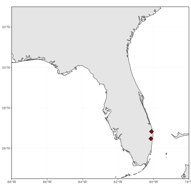
Note that coord_sf has to be called after all geom_sf calls, as to
supersede any former input.
States (polygon data)
It would be informative to add finer administrative information on top
of the previous map, starting with state borders and names. The package
maps (which is automatically installed and loaded with ggplot2)
provides maps of the USA, with state and county borders, that can be
retrieved and converted as sf objects:
library("maps")
states <- st_as_sf(map("state", plot = FALSE, fill = TRUE))
head(states)

## Simple feature collection with 6 features and 1 field
## geometry type:  MULTIPOLYGON
## dimension:      XY
## bbox:           xmin: -124.3834 ymin: 30.24071 xmax: -71.78015 ymax: 42.04937
## epsg (SRID):    4326
## proj4string:    +proj=longlat +datum=WGS84 +no_defs
##                         geometry          ID
## 1 MULTIPOLYGON (((-87.46201 3...     alabama
## 2 MULTIPOLYGON (((-114.6374 3...     arizona
## 3 MULTIPOLYGON (((-94.05103 3...    arkansas
## 4 MULTIPOLYGON (((-120.006 42...  california
## 5 MULTIPOLYGON (((-102.0552 4...    colorado
## 6 MULTIPOLYGON (((-73.49902 4... connecticut
State names are part of this data, as the ID variable. A simple (but
not necessarily optimal) way to add state name is to compute the
centroid of each state polygon as the coordinates where to draw their
names. Centroids are computed with the function st_centroid, their
coordinates extracted with st_coordinates, both from the package sf,
and attached to the state object:
states <- cbind(states, st_coordinates(st_centroid(states)))
Note the warning, which basically says that centroid coordinates using
longitude/latitude data (i.e. WGS84) are not exact, which is perfectly
fine for our drawing purposes. State names, which are not capitalized in
the data from maps, can be changed to title case using the function
toTitleCase from the package tools:
library("tools")
states$ID <- toTitleCase(states$ID)
head(states)

## Simple feature collection with 6 features and 3 fields
## geometry type:  MULTIPOLYGON
## dimension:      XY
## bbox:           xmin: -124.3834 ymin: 30.24071 xmax: -71.78015 ymax: 42.04937
## epsg (SRID):    4326
## proj4string:    +proj=longlat +datum=WGS84 +no_defs
##            ID          X        Y                       geometry
## 1     Alabama  -86.83042 32.80316 MULTIPOLYGON (((-87.46201 3...
## 2     Arizona -111.66786 34.30060 MULTIPOLYGON (((-114.6374 3...
## 3    Arkansas  -92.44013 34.90418 MULTIPOLYGON (((-94.05103 3...
## 4  California -119.60154 37.26901 MULTIPOLYGON (((-120.006 42...
## 5    Colorado -105.55251 38.99797 MULTIPOLYGON (((-102.0552 4...
## 6 Connecticut  -72.72598 41.62566 MULTIPOLYGON (((-73.49902 4...
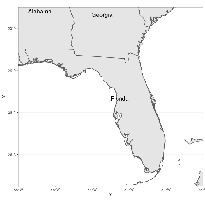
To continue adding to the map, state data is directly plotted as an
additional sf layer using geom_sf. In addition, state names will be
added using geom_text, declaring coordinates on the X-axis and Y-axis,
as well as the label (from ID), and a relatively big font size.
ggplot(data = world) +
    geom_sf() +
    geom_sf(data = states, fill = NA) +
    geom_text(data = states, aes(X, Y, label = ID), size = 5) +
    coord_sf(xlim = c(-88, -78), ylim = c(24.5, 33), expand = FALSE)
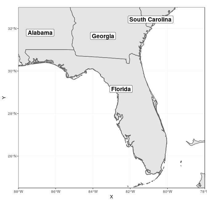
We can move the state names slightly to be able to read better “South
Carolina” and “Florida”. For this, we create a new variable nudge_y,
which is -1 for all states (moved slightly South), 0.5 for Florida
(moved slightly North), and -1.5 for South Carolina (moved further
South):
states$nudge_y <- -1
states$nudge_y[states$ID == "Florida"] <- 0.5
states$nudge_y[states$ID == "South Carolina"] <- -1.5
To improve readability, we also draw a rectangle behind the state name,
using the function geom_label instead of geom_text, and plot the map
again.
ggplot(data = world) +
    geom_sf() +
    geom_sf(data = states, fill = NA) +
    geom_label(data = states, aes(X, Y, label = ID), size = 5, fontface = "bold",
        nudge_y = states$nudge_y) +
    coord_sf(xlim = c(-88, -78), ylim = c(24.5, 33), expand = FALSE)
Counties (polygon data)
County data are also available from the package maps, and can be
retrieved with the same approach as for state data. This time, only
counties from Florida are retained, and we compute their area using
st_area from the package sf:
counties <- st_as_sf(map("county", plot = FALSE, fill = TRUE))
counties <- subset(counties, grepl("florida", counties$ID))
counties$area <- as.numeric(st_area(counties))
head(counties)

## Simple feature collection with 6 features and 2 fields
## geometry type:  MULTIPOLYGON
## dimension:      XY
## bbox:           xmin: -85.98951 ymin: 25.94926 xmax: -80.08804 ymax: 30.57303
## epsg (SRID):    4326
## proj4string:    +proj=longlat +datum=WGS84 +no_defs
##                           geometry               ID       area
## 292 MULTIPOLYGON (((-82.66062 2...  florida,alachua 2498863359
## 293 MULTIPOLYGON (((-82.04182 3...    florida,baker 1542466064
## 294 MULTIPOLYGON (((-85.40509 3...      florida,bay 1946587533
## 295 MULTIPOLYGON (((-82.4257 29... florida,bradford  818898090
## 296 MULTIPOLYGON (((-80.94747 2...  florida,brevard 2189682999
## 297 MULTIPOLYGON (((-80.89018 2...  florida,broward 3167386973
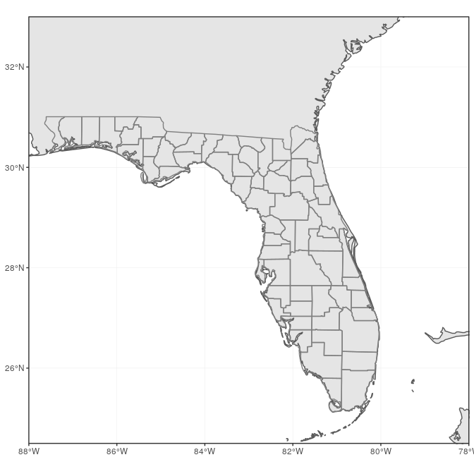
County lines can now be added in a very simple way, using a gray outline:
ggplot(data = world) +
    geom_sf() +
    geom_sf(data = counties, fill = NA, color = gray(.5)) +
    coord_sf(xlim = c(-88, -78), ylim = c(24.5, 33), expand = FALSE)
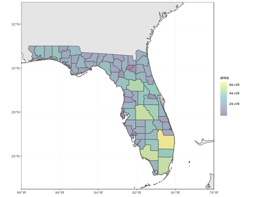
We can also fill in the county using their area to visually identify the largest counties. For this, we use the “viridis” colorblind-friendly palette, with some transparency:
ggplot(data = world) +
    geom_sf() +
    geom_sf(data = counties, aes(fill = area)) +
    scale_fill_viridis_c(trans = "sqrt", alpha = .4) +
    coord_sf(xlim = c(-88, -78), ylim = c(24.5, 33), expand = FALSE)
Cities (point data)
To make a more complete map of Florida, main cities will be added to the map. We first prepare a data frame with the five largest cities in the state of Florida, and their geographic coordinates:
flcities <- data.frame(state = rep("Florida", 5), city = c("Miami",
    "Tampa", "Orlando", "Jacksonville", "Sarasota"), lat = c(25.7616798,
    27.950575, 28.5383355, 30.3321838, 27.3364347), lng = c(-80.1917902,
    -82.4571776, -81.3792365, -81.655651, -82.5306527))
Instead of looking up coordinates manually, the package googleway
provides a function google_geocode, which allows to retrieve
geographic coordinates for any address, using the Google Maps API.
Unfortunately, this requires a valid Google API key (follow
instructions here to get a key, which needs to include “Places” for
geocoding).
Once you have your API key, you can run the following code to
automatically retrieve geographic coordinates of the five cities:
library("googleway")
key <- "put_your_google_api_key_here" # real key needed
flcities <- data.frame(state = rep("Florida", 5), city = c("Miami",
    "Tampa", "Orlando", "Jacksonville", "Sarasota"))
coords <- apply(flcities, 1, function(x) {
    google_geocode(address = paste(x["city"], x["state"], sep = ", "),
        key = key)
})
flcities <- cbind(flcities, do.call(rbind, lapply(coords, geocode_coordinates)))
We can now convert the data frame with coordinates to sf format:
(flcities <- st_as_sf(flcities, coords = c("lng", "lat"), remove = FALSE,
    crs = 4326, agr = "constant"))

## Simple feature collection with 5 features and 4 fields
## Attribute-geometry relationship: 4 constant, 0 aggregate, 0 identity
## geometry type:  POINT
## dimension:      XY
## bbox:           xmin: -82.53065 ymin: 25.76168 xmax: -80.19179 ymax: 30.33218
## epsg (SRID):    4326
## proj4string:    +proj=longlat +datum=WGS84 +no_defs
##     state         city      lat       lng                   geometry
## 1 Florida        Miami 25.76168 -80.19179 POINT (-80.19179 25.76168)
## 2 Florida        Tampa 27.95058 -82.45718 POINT (-82.45718 27.95058)
## 3 Florida      Orlando 28.53834 -81.37924 POINT (-81.37924 28.53834)
## 4 Florida Jacksonville 30.33218 -81.65565 POINT (-81.65565 30.33218)
## 5 Florida     Sarasota 27.33643 -82.53065 POINT (-82.53065 27.33643)
We add both city locations and names on the map:
ggplot(data = world) +
    geom_sf() +
    geom_sf(data = counties, fill = NA, color = gray(.5)) +
    geom_sf(data = flcities) +
    geom_text(data = flcities, aes(x = lng, y = lat, label = city),
        size = 3.9, col = "black", fontface = "bold") +
    coord_sf(xlim = c(-88, -78), ylim = c(24.5, 33), expand = FALSE)
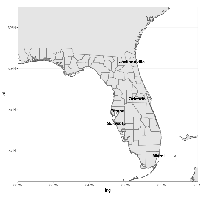
This is not really satisfactory, as the names overlap on the points, and
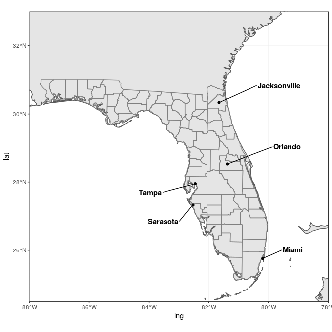
they are not easy to read on the grey background. The package ggrepel
offers a very flexible approach to deal with label placement (with
geom_text_repel and geom_label_repel), including automated movement
of labels in case of overlap. We use it here to “nudge” the labels away
from land into the see, and connect them to the city locations:
library("ggrepel")
ggplot(data = world) +
    geom_sf() +
    geom_sf(data = counties, fill = NA, color = gray(.5)) +
    geom_sf(data = flcities) +
    geom_text_repel(data = flcities, aes(x = lng, y = lat, label = city),
        fontface = "bold", nudge_x = c(1, -1.5, 2, 2, -1), nudge_y = c(0.25,
            -0.25, 0.5, 0.5, -0.5)) +
    coord_sf(xlim = c(-88, -78), ylim = c(24.5, 33), expand = FALSE)
Final map
For the final map, we put everything together, having a general background map based on the world map, with state and county delineations, state labels, main city names and locations, as well as a theme adjusted with titles, subtitles, axis labels, and a scale bar:
library("ggspatial")
ggplot(data = world) +
    geom_sf(fill = "antiquewhite1") +
    geom_sf(data = counties, aes(fill = area)) +
    geom_sf(data = states, fill = NA) +
    geom_sf(data = sites, size = 4, shape = 23, fill = "darkred") +
    geom_sf(data = flcities) +
    geom_text_repel(data = flcities, aes(x = lng, y = lat, label = city),
        fontface = "bold", nudge_x = c(1, -1.5, 2, 2, -1), nudge_y = c(0.25,
            -0.25, 0.5, 0.5, -0.5)) +
    geom_label(data = states, aes(X, Y, label = ID), size = 5, fontface = "bold",
        nudge_y = states$nudge_y) +
    scale_fill_viridis_c(trans = "sqrt", alpha = .4) +
    annotation_scale(location = "bl", width_hint = 0.4) +
    annotation_north_arrow(location = "bl", which_north = "true",
        pad_x = unit(0.75, "in"), pad_y = unit(0.5, "in"),
        style = north_arrow_fancy_orienteering) +
    coord_sf(xlim = c(-88, -78), ylim = c(24.5, 33), expand = FALSE) +
    xlab("Longitude") + ylab("Latitude") +
    ggtitle("Observation Sites", subtitle = "(2 sites in Palm Beach County, Florida)") +
    theme(panel.grid.major = element_line(color = gray(0.5), linetype = "dashed",
        size = 0.5), panel.background = element_rect(fill = "aliceblue"))
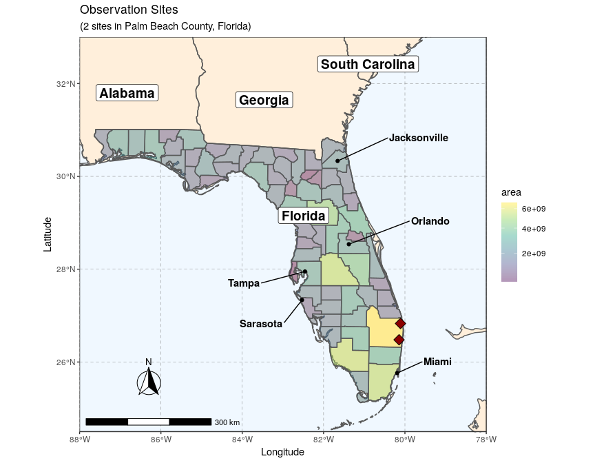
This example fully demonstrates that adding layers on ggplot2 is
relatively straightforward, as long as the data is properly stored in an
sf object. Adding additional layers would simply follow the same
logic, with additional calls to geom_sf at the right place in the
ggplot2 sequence.
