Plotting gridded data with sp
- Introduction
- Incrementally adding elements
- Axes, scale placement and size
- Specifying the scale color breaks, tics and labels
- Adding grid lines
- Plotting scale only, or image only
- Plotting gridded categorical (factor) variables
- Factors: changing the density and width of scales, label width
- Relative size of the categorical scale
- Arranging multiple plots
- Challenges
Introduction
The developments below are in the github
version of sp, and will become part of sp release 1.2-3 and higher.
Plotting spatial grids using the plot method was up till now not much
fun, and limited to either showing a grid, as in
library(sp)
demo(meuse,ask=FALSE,echo=FALSE)
plot(geometry(meuse.grid))

which only shows the cell geometry, or using image as in
image(meuse.grid["dist"])

For more advanced plots, showing color scales, one needed to use
spplot. ssplot is a powerful function, but may also be challenging
to use, plots may be challenging to fine manipulate.
The are base plots coming from plot can be improved by all the bells
and whistles of base plot, using par and by incrementally adding
features. The big missing thing though is a colour legend showing the
z-values. Both raster::plot and spatstat::plot provide colour
scales, and it is about time to add this to sp’s plot methods for
SpatialGridDataFrame and SpatialPixelsDataFrame objecs as well. With
the help of this blog
entry,
this wasn’t too much work.
plot(meuse.grid["dist"], zlim = c(0,1))

which shows a grid using a larger part of the plotting area, and a color
scale bar. zlim has been set here to ensure the scale goes to 1 (the
data go to 0.99).
The rest of this blog post shows the options now available to this plot method.
Incrementally adding elements
The new plot method uses layout to make two plotting areas, one for
the grid and one for the scale. Since the last element plotted is the
grid, we can add to it:
plot(meuse.grid["dist"], zlim = c(0,1))
title("distance to river Meuse (normalized)")
points(meuse, col = 'green')
box()

Axes, scale placement and size
Axes can be added by specifying axes = TRUE, the location of the scale
by specifying axis.pos, which follows the numbering of ?axis. Note
how the size of the scale adapts to the axes:
plot(meuse.grid["dist"], zlim = c(0,1), axes = TRUE)

plot(meuse.grid["dist"], zlim = c(0,1), axes = TRUE, axis.pos = 1)

The scale size can be reduced by specifying scale.shrink; its
thickness can be modified by scale.size:
plot(meuse.grid["dist"], zlim = c(0,1), axes = TRUE, scale.shrink = 1)

plot(meuse.grid["dist"], zlim = c(0,1), axes = TRUE, scale.size = lcm(2.4))

where lcm(2) indicates 2 cm, meaning that it isn’t affected by
changing plot size. If a numeric values is given here, e.g. 1/6, the
size is relative to the area area occupied by the grid.
to increase the white space around the gridded area, xaxs = "r" can be
passed, which adds the usual 4% on each side.
Specifying the scale color breaks, tics and labels
Color breaks are specified by breaks, specifying breaks requires
that a color ramp of matching length is specified (one less than the
number of breaks). Tics and tic labels are defined by parameter at.
When specifying breaks, zlim becomes obsolete.
b = c(0, 0.25, 0.5, 0.6, 0.7, 0.8, 0.9, 1)
col = rev(bpy.colors(length(b)-1))
plot(meuse.grid["dist"], breaks = b, col = col, at = b)

Adding grid lines
Grid lines can be added by specifying a grid cell border color, as in
plot(meuse.grid["dist"], border = grey(0.6))

This also enlightens the difference between SpatialPixelsDataFrame (as
plotted above), and SpatialGridDataFrame which has the complete set of
grid cells in a rectangular area:
library(methods)
plot(as(meuse.grid, "SpatialGridDataFrame")["dist"], border = grey(0.6))

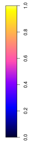
Plotting scale only, or image only
Sometimes, a user needs an image of the scale only, e.g. to glue it onto a leaflet plot when it does not properly support legends. In the following, the figure (device) width was set to 2 (inch), so that the scale still looks nice:
plot(meuse.grid["dist"], what = "scale", zlim = c(0,1))
The other option is to only plot the grid, without scale:
plot(meuse.grid["dist"], what = "image")

Plotting gridded categorical (factor) variables
Categorical (factor) variables need a different treatement, as
continuous color change does not work for them, and neither do
continuous color scales. The default color scale used in this case is
Set2 from the RColorBrewer package; see also the
colorbrewer and the command
RColorBrewer::display.brewer.all().
plot(meuse.grid["ffreq"])

plot(meuse.grid["ffreq"], axis.pos = 1)

Factors: changing the density and width of scales, label width
The amount of space taken up by a colored field in a legend class can be
manipulated. Argument scale.n determines how many fields would fill a
complete side (default 15), increasing it decreases the (here vertical)
size of a color field:
plot(meuse.grid["ffreq"], scale.n = 25)

Argument scale.frac determines which fraction of the scale area is
taken by the coloured bar; in this case (axis.pos=4) it determines the
width of the color area (default 0.3):
plot(meuse.grid["ffreq"], scale.frac = 0.5)

In the following example, wide labels need extra space; this is created by
- increasing
scale.size, so there is more space for the scale + labels - decreasing
scale.fracso that the absolute size of the bar remains the same
levels(meuse.grid$ffreq) = c("frequent", "moderately frequent", "infrequent")
plot(meuse.grid["ffreq"], scale.size = lcm(5.8), scale.frac = 0.15)

Relative size of the categorical scale
The relative size of a scale compared to the rest of the image, including its fonts, can be manipulated by changing the total size of the graph. In the following, the size is set to 12 x 12 (inch); the (automatic) resizing of the final image gives a seemingly smaller scale:
plot(meuse.grid["dist"])

Arranging multiple plots
Multiple plots can be arranged on a single device using layout. Since
plot already uses layout when arranging the image and the scale,
simply putting two images with scales side by side is not simple –
layouts cannot be nested. A solution is to create plots of only image
and scale (taking care of zlim), and have them precede by an
appropriate layout statement. For a shared legend, e.g. by
layout(matrix(1:3, 1, 3), widths = c(4,4,1))
plot(meuse.grid, what = "image", zlim = c(0,1))
plot(meuse.grid["dist"], what = "image", zlim = c(0,1))
plot(meuse.grid["dist"], what = "scale", zlim = c(0,1))

and for separate legends e.g. by
layout(matrix(1:4, 2, 2), heights = c(4,1))
levels(meuse.grid$ffreq) = c("fr", "mo", "inf")
plot(meuse.grid["ffreq"], what = "image")
plot(meuse.grid["ffreq"], what = "scale", axis.pos = 1)
plot(meuse.grid["dist"], what = "image", zlim = c(0,1))
plot(meuse.grid["dist"], what = "scale", axis.pos = 1, zlim = c(0,1))

More powerful arrangment methods are obtained when using plotting
methods available in package grid, or higher-level plotting functions
such as spplot or ggplot2::ggplot.
Challenges
- integrate this with the plotting of other classes with attributes,
in particular
SpatialPolygonsDataFrameandSpatialLinesDataFrame - get the text labels along vertical continuous scales horizontal,
meaning don’t use
axisand more managment of space - unify the scaling of the scale bars for the two different scale types (continuous, categorical)
- deal with the multiple plot issue more elegantly